A UX audit template does one useful thing: it turns a vague sense that a product could be better into a scored, repeatable process. Instead of one person's opinion on a Tuesday, you get a consistent evaluation that anyone can run and that produces the same kind of result every time.
A template is the working document behind the method. For the method itself, see our complete UX audit guide. This template is a fixed-format companion to the more detailed UX audit checklist.
This template comes in two parts. A checklist you score the product against, and a report skeleton that turns your scores into a document stakeholders read. Both are below, and both are free with no email wall.
Download the printable template
If you would rather work from a printed sheet or a PDF, open the printable UX audit template. It has every checkpoint on this page plus the report skeleton, formatted to print cleanly. Open it and use your browser's print to PDF, or tick the boxes on screen. There is no email wall and nothing to sign up for. Keep a copy in your team's shared drive so the next audit starts from the same structure as the last one, which is what makes the scores comparable over time.
How to use the template
Work through each dimension in order. Score each checkpoint on a simple scale: 0 means it fails completely, 1 means it partially passes, 2 means it fully passes. Total each dimension and turn it into a percentage. Any dimension scoring below 60 percent is a priority area.
One rule matters more than the rest: score the whole product before you fix anything. It is tempting to stop and fix each issue as you spot it, but that is how teams spend a sprint polishing minor problems while a critical one sits untouched. Score first, prioritise second, fix third. It feels slower and it is faster, because you never waste effort on a problem that did not deserve it.
Why a template beats an ad-hoc review
You could just open your product and look for problems. Most teams do, and it is why the same issues survive redesign after redesign. An ad-hoc review depends entirely on who is looking and what mood they are in. One reviewer notices the cramped mobile nav, another fixates on the colour of a button, and neither writes it down in a way the next person can build on.
A template removes that randomness. Because everyone scores the same checkpoints on the same scale, two people auditing the same product land in roughly the same place, and disagreements become specific and settleable rather than a clash of taste. It also makes the work cumulative. When you re-run the template in three months, you are not starting from scratch, you are comparing two scores and seeing exactly which dimensions improved. That comparison is impossible without a fixed structure, and it is the single most persuasive thing you can put in front of a stakeholder who wants to know whether the UX work is paying off.
The checklist
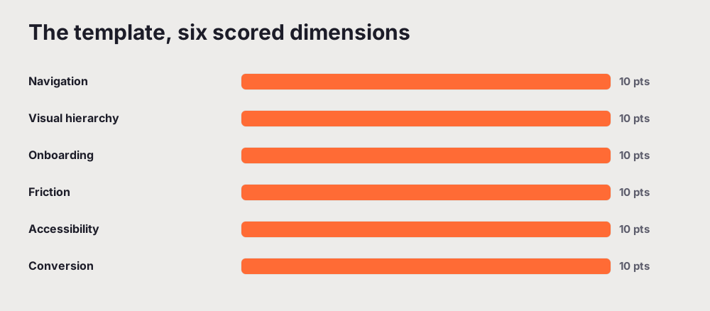
The core template covers six dimensions, ten points each. The printable version adds focused checks for mobile, content clarity, and performance.
1. Navigation (10 points)
If people cannot find the main feature or tell where they are, nothing else on the list gets a chance to matter.
- Primary navigation is visible and legible on all device sizes
- The active state clearly shows where the user currently is
- No more than two levels of navigation depth for core flows
- Search is available and returns relevant results
- Back button and breadcrumbs work correctly throughout the product
2. Visual hierarchy (10 points)
Each screen should point the eye at the one thing that matters. When everything is emphasised, nothing is.
- The primary CTA is visually dominant on every key screen
- Font sizes create a clear hierarchy from heading to body
- Colour contrast meets WCAG AA, 4.5 to 1 for text
- Whitespace is used intentionally to group related elements
- The most important content loads above the fold on mobile
3. Onboarding (10 points)
The gap between signup and first value is where most products lose people. These checkpoints close it.
- First-time users complete the core action without contacting support
- Empty states explain what to do next, not just "nothing here yet"
- Progress indicators are shown for multi-step flows
- Error messages explain exactly what went wrong and how to fix it
- Tooltips or walkthroughs are available for complex features
4. Friction and forms (10 points)
Every field you ask for is a chance to lose someone. Ask for less, and ask at the right moment.
- Forms ask only for the minimum information at each step
- Field labels stay visible when the field is focused
- Inline validation fires on blur, not only on submit
- Autocomplete is enabled for appropriate fields
- Long forms are broken into logical steps with clear progress
5. Accessibility (10 points)
This is both a real user need and a growing legal one, and most of the fixes are small once you find them.
- Every interactive element is reachable by keyboard
- Focus indicators are visible and not removed in CSS
- Touch targets are at least 44 by 44 pixels on mobile
- Images carry descriptive alt text
- Colour is not the only way information is conveyed
6. Conversion design (10 points)
These are the screens where people decide to commit, so a small change here often moves a real number.
- CTA copy is specific and outcome-focused
- Social proof sits near the primary CTAs
- Trust signals appear on signup and payment screens
- Pricing is clear with no fees hidden until checkout
- Checkout is reduced to the minimum number of fields
The printable template continues into mobile UX, content clarity, and performance. Whether you use the six core dimensions or all nine, the method is the same: score, total, prioritise.
From checklist to report
The checklist tells you what to look at. The report is how you get anything fixed. A UX audit report that stakeholders actually read has a predictable shape, and using the same shape every time makes your audits comparable over months.
Start with a one-page executive summary: the scope, the date, the headline verdict, and the top three priority issues, because decision-makers often read only this. Follow with the scope and method, then a dimension-by-dimension score on a consistent scale. The core of the report is the findings, each one stating the specific problem, its location, evidence such as a screenshot or an analytics number, a severity from critical to low, and a concrete recommendation. Add a short section on what is working well, so the team knows what not to break, and close with a prioritised action plan split into immediate, short-term, and long-term work.
The report skeleton
Copy this structure and fill in the brackets. The hard thinking already happened during the audit, so the write-up should be fast.
UX Audit Report for the product name, with the audit date and who ran it. Executive summary: overall score out of 100, the top three issues, and the recommended actions. Methodology: scope, method, and tools. Dimension scores: a short table with a score per dimension. Findings: for each, a title, a description, the evidence, a severity, and a recommendation. What is working well: the positives worth protecting. Prioritised action plan: immediate, short-term, and long-term, each with a rough effort estimate. Appendix: full screenshots, notes, and data exports.
Running your first audit with this template
If you have never done this before, here is the whole flow in one pass so it does not feel abstract.
To see what a finished audit looks like first, see a real UX audit report.
Pick a scope. Do not audit the entire product on your first run. Choose the one flow that matters most, usually the path from landing to signup to first real action, and audit that end to end on both desktop and mobile. A focused audit you finish beats a sprawling one you abandon halfway.
Capture as you go. Take a screenshot of every screen in the flow before you score, so that when you write findings later you already have the evidence. Score each checkpoint against what you see, not against what you know the product could do with more time.
Total and rank. Add up each dimension, turn it into a percentage, and line the dimensions up from weakest to strongest. The weakest one or two are where your next sprint goes. Inside those, fix the checkpoints that sit on the revenue or activation path first.
Write it up. Move the findings into the report skeleton, adding a severity and a recommendation to each. Keep every finding tied to something a user is trying to do. That is the difference between a report that changes what the team builds next and one that gets filed and forgotten.
The first time through, the whole thing might take an afternoon. By the third time it takes an hour, because you know the checkpoints and you have a rhythm. That speed is the point: a template you can run quickly is a template you will run often, and frequency is what actually keeps a product's UX from drifting.
Common mistakes to avoid
A few habits quietly weaken an otherwise good audit. Skipping the mobile experience, when most traffic is on a phone. Using subjective language, where "feels dated" should be a specific, located finding. Leaving out the positives, which makes the report read like a complaint rather than an assessment. And handing over problems without recommendations, which gives the reader work instead of decisions. The template is built to steer you away from all four, as long as you fill in every part rather than the ones that are easy.
After the audit: turning scores into a roadmap
A scored template is only half the value. The other half is what you do with the numbers, and this is where most audits quietly die. A team finishes the checklist, feels good about the effort, and then nothing changes because the results never became a plan.
Avoid that by turning the scores into three buckets. The first is quick wins: checkpoints that failed but are cheap to fix, a vague CTA label, a contrast that misses the standard, a missing confirmation message. Ship these this week, because they build momentum and often move a metric on their own. The second is structural work: a weak dimension that needs real design time, such as an onboarding flow that scored 40 percent. Put these in the next sprint or two. The third is strategic: the deep issues that touch architecture or the business model, which belong on a quarterly roadmap rather than a sprint.
The template makes this triage almost automatic, because every failed checkpoint already carries a rough sense of effort and you already know which dimensions scored worst. Line the failures up by impact against effort, and the order of work reveals itself. Then, and this is the part teams skip, put a date and an owner on each bucket. An audit without owners is a wish list. An audit with owners is a plan.
When to reach for the automated version
Working through 60-plus checkpoints by hand is a genuinely useful exercise, especially the first few times, because it teaches you what good looks like. It is also slow, which is why most products get audited far less often than they should.
If you want the same structure run against your live product in minutes, run a free UX audit. It scores the same dimensions, applies the same 0 to 2 logic, and hands you the prioritised, report-ready version of everything above. Use the template to learn the method by hand, and the automated audit to run it on a schedule you can actually keep, before every release rather than once a year when something has already gone wrong.
To see the whole process the template supports, read how to do a UX audit.
Related reading: How to Write a UX Audit Report That Clients Actually Read
Frequently asked questions
What is a UX audit template?
A UX audit template is a reusable structure for evaluating a product: a checklist of checkpoints grouped by dimension, a scoring scale, and a report layout for writing up what you find. Using a template makes audits consistent, so results from one review can be compared to the next and anyone on the team can pick up the work.
Is there a free UX audit template I can download?
Yes. The printable template on this page is free, with no email required. It includes 60-plus scored checkpoints and a report skeleton: the six dimensions UXAuditPro scores, plus focused checks for mobile, content clarity, and performance that the printable version adds. Open it, then print to PDF or check items off on screen.
What is the difference between a UX audit template and a report template?
A UX audit template is the checklist you evaluate against, the working document. A report template is the deliverable you hand to stakeholders. This page includes both, because using the same audit template repeatedly is what lets a report show progress over time.
How do I use a UX audit template?
Score each checkpoint 0, 1, or 2, total each dimension into a percentage, and treat anything under 60 percent as a priority. Then move the findings into the report skeleton, adding evidence and a recommendation for each. Score the whole product before you start fixing, so you work in priority order rather than in the order you happened to find issues.