You spend two weeks on the audit. You compile dozens of screenshots, watch hours of session replays, and write thirty pages of careful findings. The client reads the executive summary, skims the recommendations, and drops the rest into a folder they never open again.
The report is the last step of a wider process. If you have not run the audit yet, start with our complete UX audit guide and how to do a UX audit. To score from a reusable document first, use the free UX audit template.
This happens almost every time. Not because clients do not care about UX. They do. It happens because most audit reports are written for the auditor, not the audience. The report becomes a record of how hard you worked instead of a tool the reader can act on.
Here is how to write one that gets read, understood, and acted on.
Before you write, gather these
The quality of the report is set before you type a word. Have five things in front of you. The scored findings from the audit itself, each already rated for severity. The analytics that show where users actually drop off, so you can attach a number to the findings that sit on real paths. Screenshots of every issue, captured on both desktop and mobile. The product's stated goals, so you can judge findings against what the team is trying to achieve rather than against your own taste. And a clear picture of who will read the report, because a founder, a product manager, and an engineering lead each want something different from the same document.
That last point drives everything else. A report written for "the client" as an abstraction pleases no one. A report written knowing that the founder reads the first page, the PM reads the findings, and the engineer reads the action plan can serve all three at once, as long as each of those parts is clearly separated and self-contained.
Start with the score
The first thing your report should show is a single, clear overall score. Not a paragraph about methodology. Not a page of caveats. A number.
"Your product scored 61 out of 100 on UX quality."
A score does two things. It creates an immediate reaction that makes the reader want to know what it means, and it gives them a benchmark to improve against. Everything else in the report exists to explain that number. Put it on the first line, in large type, and let the rest of the document earn it back.
A single number also makes progress legible. When you re-audit in three months and the score moves from 61 to 74, that is a story a team can rally around and a founder can put in a board update. A stack of individual fixes does not carry the same weight. This is also why the scale has to stay constant between audits: the moment you change how you score, the comparison breaks and the number stops meaning anything. Pick a scale, write it down in the methodology, and keep it.
Lead with business impact, not UX theory
Clients do not care about the ten usability heuristics. They care about conversion, revenue, and retention. Translate every finding into a business consequence.
Instead of: "The navigation violates the principle of recognition over recall."
Write: "Users cannot find the main feature without help. In testing, four of five new users gave up before completing their first action, which is likely feeding your 60 percent drop-off on day one."
Every finding should answer one question: so what does this mean for the business? If a finding cannot be tied to a user outcome or a number, it is probably taste, and taste does not belong in an audit report.
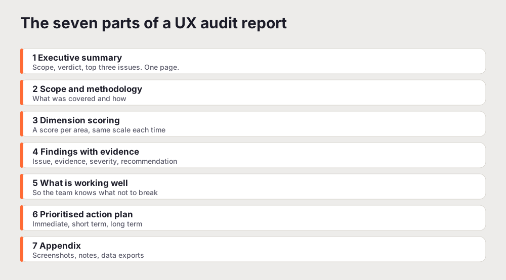
The seven parts of a report that works
A strong report has a predictable shape. The reader should never wonder where to find something.
1. Executive summary, one page. The overall score, three to five bullets on the biggest issues, and one sentence on the business impact of fixing them. This is what a busy CEO or PM reads, and often the only part. Make it enough on its own.
2. Scope and methodology. What you audited, how, who did it, what tools you used, and what you did not cover. A reader trusts a diagnosis more when they can see how it was reached.
3. Dimension scoring. Break the audit into clear dimensions and score each on a consistent scale. Using the same scale every time turns follow-up audits into a progress chart rather than a fresh argument.
4. Findings with evidence. The core of the report, covered in detail below.
5. What is working well. Most reports skip the positives. That is a mistake. Documenting what works shows you did a complete analysis, and it tells the team what not to break while they change other things.
6. Prioritised action plan. The sequenced list of what to fix first, second, and third, grouped into immediate, short term, and long term, each with a rough effort estimate.
7. Appendix. Full screenshots, session notes, and data exports for the people who want to go deep.
How to write a single finding
The findings section is where reports live or die. Every finding needs four things, in this order.
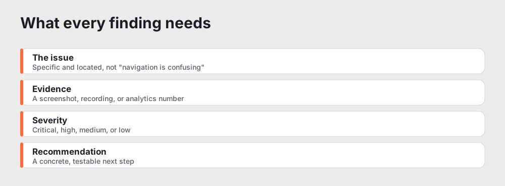
The issue. One sentence, specific and located. "The primary CTA on the pricing page sits below the fold on mobile" is a finding. "Navigation is confusing" is not.
The evidence. A screenshot, a recording, or an analytics number. Never include a finding you cannot support. The moment a reader spots one finding that is really just an opinion, they start doubting all of them.
The severity. Critical means users cannot complete a core task. High means they struggle with an important one. Medium means friction and frustration. Low means minor polish. Rank on user impact, not on how easy the fix is.
The recommendation. Specific and testable. "Move the primary CTA above the fold on mobile and change the label from Submit to Start free trial" is a recommendation. "Improve the CTA" is not.
Keep each finding to half a page at most. Long explanations of individual issues lose the reader, and the detail belongs in the appendix.
Organise by priority, not by page
Group findings by severity, not by where they appear in the product. A reader wants to know what to fix first, not what you happened to look at first. Lead with the critical items, then high, then medium, then low. Number them so people can reference "finding 7" in a meeting without flipping pages.
Screenshot rules
Every finding needs a screenshot, and screenshots alone are not enough. Annotate them. Draw a box around the exact element, add a short label, and make it impossible to misread what you are pointing at. An unannotated screenshot asks the reader to work out what they are looking at, and most will not bother.
The length problem
Most UX audit reports are too long. Aim for 15 to 20 pages for a comprehensive audit. If you are delivering 50 or more, you are including things that do not help anyone decide. For each section, ask: if I removed this, could the reader still act? If yes, cut it. A focused 15-page report that gets acted on is worth more than a 60-page document that gets filed.
Format for skimming
Assume the reader skims before they read, and design for that. Use a clear heading hierarchy. Use severity badges as visual anchors. Number the findings. Pull key recommendations into callout boxes. Put the single most important sentence first in every section. A report that survives a skim is a report that gets a second, closer read.
The test is simple. Hand the report to someone who was not involved and give them 60 seconds. If they can tell you the score, the top problem, and the first thing you would fix, the structure works. If they come back confused, the content might be fine but the formatting is hiding it, and no amount of detail will rescue a report the reader cannot navigate.
Common mistakes that sink a report
Five patterns show up again and again, and each one quietly costs the report its authority.
No scoring system. A list of issues with no severity leaves the reader unable to prioritise, so they either fix the easy things or nothing at all. Always score.
Subjective language. "The design feels outdated" is an opinion. "The interface uses a typeface deprecated in the brand guide two years ago" is a finding. The more your report reads like a diagnosis and less like a review, the more it gets acted on.
Skipping the mobile experience. More than half of most products' traffic is on a phone. A report that audits only desktop has missed the majority of the real experience, and readers who use their own product on mobile will notice the gap immediately.
All problems, no positives. A report that is nothing but faults reads like a hit piece, not an assessment. It also fails a practical purpose: without knowing what works, the team risks breaking it while fixing something else.
Burying the recommendation. Every finding needs a proposed fix attached to it. A report full of problems and thin on recommendations hands the reader a pile of work instead of a set of decisions, which is the opposite of what they paid for.
A report skeleton you can copy
If you are starting from a blank page, this structure gets you moving.
UX Audit Report for the product name. Audit date, and who ran it. Executive summary with the overall score out of 100, the top three issues, and the recommended actions. Methodology covering the scope, the method, and the tools. Dimension scores as a short table. Findings, each with a title, a description, evidence, a severity, and a recommendation. A short section on what is working well. A prioritised action plan split into immediate, short term, and long term. An appendix for the supporting material. Fill each part in the order above and the report almost writes itself, because the hard thinking already happened during the audit.
Presenting it, not just sending it
A report that lands as an email attachment competes with everything else in the inbox. When the stakes are high, walk the reader through it. A 20-minute session where you show the score, the three findings that matter most, and the first two things you would fix changes how the document is received. People engage with a problem they have watched you explain far more than one they were left to read alone.
Keep the live version even shorter than the document. Lead with the score, show one or two annotated screenshots of the worst findings, and end on the action plan. Leave the depth in the written report for the people who want it. The goal of the meeting is agreement on what to do first, not a tour of every issue. If you get that agreement, the report has done its job, and the rest of the pages become the reference the team returns to as they work through the fixes.
The fastest way to produce a professional report
Writing a detailed UX audit report from scratch takes 8 to 15 hours on top of the audit itself. That is the tax that makes teams audit less often than they should.
UXAuditPro generates a structured report in minutes, scored across six UX dimensions, with prioritised findings, severity ratings, and specific recommendations. You can export it as a PDF, or use the white-label tier to deliver it under your own branding. A lot of freelance designers and small agencies use it to produce deliverables faster without dropping quality. Whether you write the report by hand or generate it, the rules above are what decide whether anyone reads it, acts on it, and comes back to it when the next release is due.
The findings you write up usually come from a heuristic evaluation, so it helps to know what that method does and does not catch.
Related reading: The 60-Point UX Audit Checklist
Frequently asked questions
What should a UX audit report include?
Seven parts: an executive summary with the overall score and top issues, the scope and method, dimension-by-dimension scoring, detailed findings with evidence and severity, a short section on what is working well, a prioritised action plan, and an appendix. The executive summary should stand on its own, because many readers only get through the first page.
How long should a UX audit report be?
Aim for 15 to 20 pages for a comprehensive audit. If you are past 50 pages you are almost certainly including material that does not help anyone make a decision. A focused report that gets acted on beats a long one that gets filed.
How do I make a UX audit report clients actually read?
Lead with a single overall score, translate every finding into a business consequence rather than a heuristic, structure it so the first page stands alone, annotate every screenshot, and design the whole thing to be skimmed. The goal is that a busy reader can get the gist in two minutes and the detail when they want it.
What is the difference between findings and recommendations?
A finding states the problem, where it happens, and why it matters. A recommendation states the specific change to make. Every finding in a good report is paired with a recommendation, because a problem without a proposed fix leaves the reader with work rather than a decision.