
Your signup page has a problem you stopped seeing months ago. So does your onboarding, your empty dashboard, and the button that is supposed to turn a visitor into a user. You built all of it, which means you carry the context that makes it feel obvious, and your new users do not. The trouble is you are two weeks from a launch, or a month from a raise, and a proper design review sounds like something you do when you have a design team and a spare fortnight. You have neither. You have two hours.
Two hours is enough. Not for everything, but for the part that matters: finding the specific places your product loses people and turning that into a short, ranked list of fixes. This is the time-boxed version of a UX audit, built for a founder to run alone. The goal is not a polished report. It is a page you can act on before the thing you are preparing for.
The full method, the one with usability sessions and a detailed writeup, is worth doing when you have the time and the traffic to justify it. If you want that version, our complete UX audit guide lays it out end to end. What follows is the compressed one, and the compression is the point.
Why a two-hour audit is worth doing
The instinct when you are busy is to skip the audit and trust your gut. The problem is that your gut is the least reliable instrument you own here, because you know where everything is. You know the button on the top right does the important thing. You know the empty state fills in once you add a project. A first-time user knows none of that, and the gap between your knowledge and theirs is exactly where drop-off hides.
A short, structured audit fixes this by forcing you out of your own head for a couple of hours. It is not thorough. It will miss things. But it reliably catches the loud problems, the ones a stranger would hit in the first two minutes, and those are almost always the ones costing you the most. Before a launch or a raise, catching the loud problems is the whole job. You are not trying to make the product perfect. You are trying to make sure the first thing a new user or an investor touches does not trip them.
There is a second reason to time-box it. An audit with no clock tends to sprawl into a rewrite. You start fixing copy while you are still supposed to be finding issues, then you notice the spacing is off, and three hours later you have polished one screen and never looked at the rest. The two-hour limit is a constraint that keeps you honest: find the problems now, fix them later, and do not let the interesting rabbit holes eat the pass.
Before you start: cut the scope hard
The single decision that makes or breaks a two-hour audit is what you refuse to look at. Most audits fail not because the method is wrong but because the scope is infinite. You cannot review a whole product in two hours, so do not try. Pick the flows that carry your business and ignore the rest on purpose.
For nearly every early-stage startup, that means two flows: the path from landing on the product to signing up, and the path from a new account to the user first real moment of value. Those two carry your activation and, downstream, your revenue. If a visitor cannot sign up without confusion, nothing else matters. If they sign up and then stare at an empty screen with no idea what to do, you have a retention problem that a prettier pricing page will never fix.
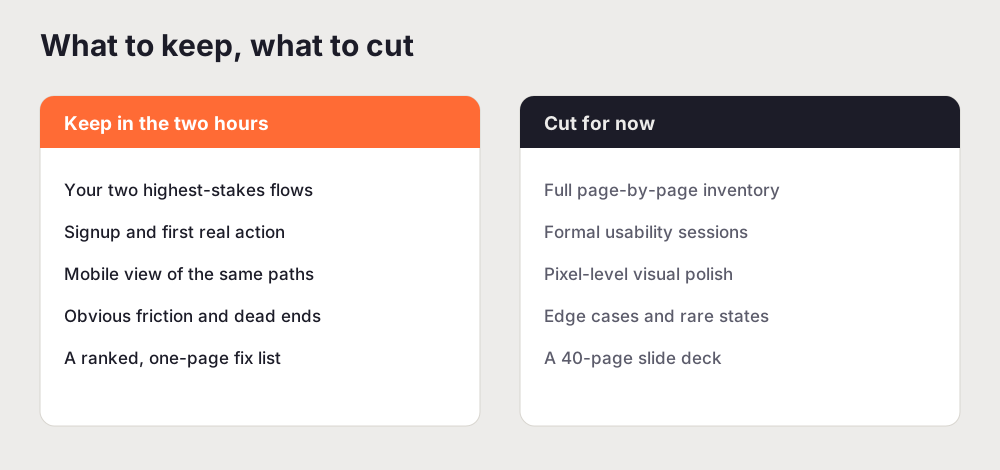
Here is what to cut, and why cutting it is safe for now:
- The full page-by-page inventory. Cataloguing every screen is what a complete audit does. It is valuable and it is slow. Skip it.
- Formal usability testing. Recruiting and running sessions is the highest-signal thing you can do, and it does not fit in two hours. Note it as a follow-up.
- Pixel-level visual polish. Alignment and spacing matter, but they rarely block a user. They are a sprint-two problem.
- Rare edge cases and error states. Worth auditing eventually. Not what loses you the median new user this week.
- The slide deck. You are writing one page for yourself, not a client report. The deliverable is a list, not a document.
Cutting all of that is not laziness. It is triage. You are spending your two hours where the leverage is, and writing down the rest so it does not nag at you while you work.
The 2-hour UX audit, step by step
The method mirrors a full audit in shape, just faster and narrower. If you have ever read how to do a UX audit the sequence will feel familiar. The difference is the clock.
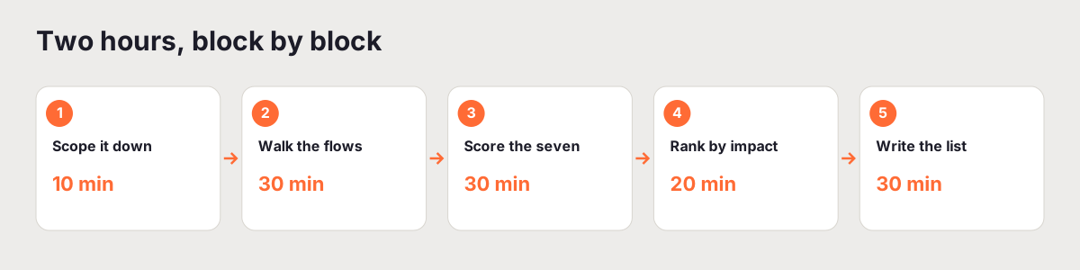
Step 1: Scope it down (10 minutes)
Write down your two flows in one sentence each. For example: "From the homepage, a new visitor signs up for a free account," and "A new account holder creates their first project and sees it saved." Naming the flows this precisely does two things. It commits you to a start and an end, so you know when you are done, and it stops you wandering into settings pages and admin screens that no new user touches in their first session.
Step 2: Walk the flows as a first-time user (30 minutes)
Open the product in a private or incognito window so you are not logged in and not carrying saved state. Then move through each flow slowly, on desktop first and then on your phone. Your only job is to notice friction. Every time you pause, squint, backtrack, or think "wait, where do I click," write it down with the screen it happened on. Do not fix anything yet. Fixing is the enemy of finding, because the moment you start editing you stop seeing the flow as a whole.
Pay special attention to the moments between screens. Drop-off almost never happens in the middle of a page. It happens at the seams: the click that does not do what you expected, the form that rejects your input without saying why, the confirmation that never comes so you are not sure it worked. Those seams are where users quietly leave, and they are the cheapest things to fix once you see them.
The phone pass matters more than founders expect. A large share of first touches happen on mobile, and a flow that is fine on a wide monitor can fall apart on a narrow screen where the primary button sits below the fold or a form field is impossible to tap. If mobile is a weak spot, our mobile UX audit guide goes deeper than two hours allows, but even a quick walk on a real phone will surface the worst of it.
Step 3: Score the six dimensions fast (30 minutes)
Now go back through your notes and score each flow across six dimensions: navigation, visual hierarchy, friction points, accessibility, conversion design, and mobile UX. A one-to-five scale is plenty. The score itself is not the deliverable. The value is in the discipline: rating every dimension forces you to look at the ones you were ignoring. Founders obsess over the parts they find interesting and skip the parts they do not, and accessibility and friction are the usual casualties. Scoring all six is how you catch the blind spot.
A rough read on each dimension:
- Navigation. Can a new user tell where they are and how to get to the next step without a map?
- Visual hierarchy. Does the most important action on each screen look like the most important thing? If everything shouts, nothing does.
- Friction points. Where does a first-time user hesitate, backtrack, or stop? Watch the seams between screens, and watch the words: if the copy assumes context you have and they do not, a lot of that hesitation is really a cognitive load problem wearing a copy problem as a disguise.
- Accessibility. Is the contrast readable, are the tap targets big enough, does the flow work from the keyboard? These are not extras, they are whether some people can use it at all.
- Conversion design. Is the primary action obvious, above the fold, and free of things that make a person hesitate? Small friction compounds. If you want the deeper version of this, see how to find and fix conversion leaks in SaaS onboarding.
- Mobile UX. Does the same flow hold up on a phone, or does it quietly break?
Step 4: Rank by impact and effort (20 minutes)
You now have a pile of issues. A pile is not a plan. Sort every one of them into three buckets: fix before you launch or pitch, fix this month, and park it. The sorting rule is impact first, effort second. A problem that blocks the main flow goes in the top bucket even if it is annoying to fix. A cosmetic issue that takes a week goes to the bottom no matter how much it bothers you personally.
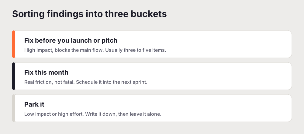
Be ruthless about the top bucket. It should hold three to five items, not fifteen. The point of a pre-launch or pre-raise audit is to fix the things that would embarrass you or lose you a user in the first thirty seconds, and there are never fifteen of those. If your top bucket is overflowing, you are not ranking, you are listing. Force the hard calls.
Step 5: Write the one-page fix list (30 minutes)
Take the top bucket and turn it into a single page. For each item, write four things: the issue, the screen it lives on, why it matters, and the fix. That is it. Keep the whole thing to one page so it is something you actually use rather than a document you file. A ranked list of five fixes with clear next steps will do more for your product than a forty-page report that reads well and changes nothing.
If you do want to hand this to a cofounder or an investor, the same principle that makes a full audit report land applies here: lead with the impact, not the mechanics. A reader should be able to see in one glance what is broken, how much it matters, and what you plan to do about it.
A quick word on what this audit is not
This is a triage tool, not a substitute for the real thing. A two-hour audit will not tell you why users churn after week three, because that needs data and conversations you cannot fake in an afternoon. It will not catch subtle usability problems that only show up when you watch a stranger struggle. And it will not replace the deeper, whole-product review you should run once you have the traffic and the team to justify it.
What it will do is give you a fast, honest read on the flows that matter most, right when you need it. Think of it as the pre-flight checklist, not the full inspection. You run it because it is cheap, it is fast, and it reliably catches the problems that would otherwise greet your next hundred users or your next investor.
Run it, then run it again
The best thing about a time-boxed audit is that it is repeatable. Two hours is short enough to do every quarter, or before every meaningful launch, without it ever becoming a project you dread. Run it now on your two core flows, ship the top bucket, and put a reminder in the calendar to run it again before the next big moment.
If you would rather not walk all six dimensions by hand, you can run a free UX audit to get a scored baseline in a few minutes, then spend your two hours working the fix list instead of building it from scratch. Either way, the shape is the same: scope hard, walk it like a stranger, score every dimension, rank without mercy, and leave with a page you will actually use. That page, not the report you never wrote, is what moves the product before your launch or your raise.
Related reading: How to Do a UX Audit: A Complete Step-by-Step Guide
Frequently asked questions
Can you really do a UX audit in two hours?
Yes, if you scope it hard. A two-hour UX audit will not cover every page or replace formal usability testing. What it does cover is the one or two flows that carry your revenue and retention, scored across the six dimensions that matter, and ranked into a short fix list. For an early-stage startup, that focused pass usually surfaces the handful of problems actually costing you signups, which is what you need before a launch or a raise.
What should a startup UX audit focus on?
Focus on the flows that map to money and retention, which for most startups means signup and the path to a user first real action. Score those on navigation, visual hierarchy, friction points, accessibility, conversion design, and mobile UX. Skip the full page-by-page inventory, pixel-level polish, and rare edge cases. Depth on the two flows that matter beats a shallow skim of the whole product.
When should a founder run a UX audit?
Run one before any moment that puts your product in front of fresh eyes: a launch, a fundraise, a big traffic push, or a redesign. It is also worth a quick pass whenever signups slide while traffic holds steady, because that gap usually means the problem is in the experience rather than the marketing. A time-boxed audit is cheap enough to repeat every quarter.
Do I need a designer to audit my own product?
No. A founder who knows the product and is willing to walk it as a first-time user can run this audit alone. You are looking for hesitation, dead ends, and unclear next steps, which do not require a design background to spot. A designer helps most later, on the fixes, not on finding the problems in a two-hour pass.
What is the difference between a startup audit and a full UX audit?
The method is the same. The scope is not. A full UX audit reviews the whole product across every flow and often runs for days, with usability testing and a detailed report. A startup audit compresses that into two hours by cutting scope to your two most important flows and trading a formal deliverable for a one-page fix list you can act on the same day.