A UX audit is a structured, evidence-based evaluation of a product's user experience. Done properly, it does not just tell you what is broken. It tells you which issues cost you the most users, and exactly what to change first.
This is the hands-on method. If you first want the lay of the land, our complete UX audit guide explains what a UX audit is and when to run one, and what a user experience audit includes answers the scope and cost questions.
This is the full method professional UX researchers use, written so a product manager or founder can run it without a research background. It works whether you do it by hand or with a tool. By the end you will have a scored audit, a ranked list of findings, and a roadmap you can put into your next sprint. If you are short on time before a launch or a fundraise, the compressed 2-hour UX audit for startups covers the same shape in a single afternoon.
What a UX audit actually is
A UX audit, sometimes called a usability audit or UX review, is a systematic assessment of how well your product lets users reach their goals. It is expert-led rather than participant-led: instead of recruiting people to test, you evaluate the product against established principles, the way a building inspector checks a house against code.
A complete audit produces four things. An overall UX score. Dimension-level scores across areas like navigation, accessibility, and conversion. A prioritised list of findings, each with a severity. And fix recommendations sequenced into a plan. Miss any of those and you have notes, not an audit.
The reason this matters: a list of problems with no ranking is impossible to act on, and a ranking with no plan never ships. The method below is built to produce all four.
The dimensions a UX audit scores
Most of the argument about UX is really an argument about which part of it you mean. Breaking the experience into dimensions fixes that, because it forces you to look at each area on its own rather than reacting to a general impression. A thorough audit scores seven.
Navigation and information architecture. Can a new visitor find the main feature quickly, and always tell where they are? This is the skeleton everything else hangs on.
Visual hierarchy. Does each screen guide the eye to the one thing that matters, or does everything shout at once? When every element is emphasised, nothing is.
Onboarding and first use. Do new users reach a first win without contacting support? The gap between signup and first value is where most products lose people.
Friction and forms. Are you asking for more than you need, at the wrong moment? Every extra field and every unclear error is a place to drop off.
Accessibility. Can the product be used with a keyboard and a screen reader, and does contrast meet the standard? This is both a real user need and a growing legal one.
Conversion design. Is the value clear, and is trust established near the moments of commitment, the signup and the payment?
Mobile, content clarity, and performance. Does the experience hold up on a phone, in plain language, on a slow connection? For many products this is the majority of real usage. Content clarity in particular comes down to the words themselves, which is worth a dedicated UX writing audit once the structure is sound.
Scoring each dimension separately turns a vague sense that "the product feels off" into a specific picture: strong on navigation, weak on onboarding, failing on accessibility. That picture is what makes the rest of the audit actionable.
When to run a UX audit
Run one before you spend money reacting to a problem you have not diagnosed. In practice, that means before a redesign, when conversion or activation drops while traffic holds, before a fundraise, and on a regular cadence so regressions get caught early. A quick audit each quarter and before every major release keeps small problems from compounding into a rebuild.
Now the method.
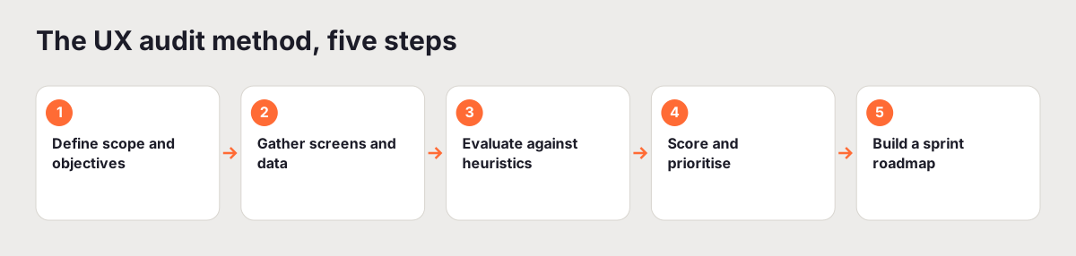
Step 1: Define scope and objectives
Before you look at a single screen, decide two things: what is in scope, and what a good outcome looks like.
Scope keeps the audit finishable. Auditing an entire product in one pass produces fatigue and a report nobody reads. Pick the flows that matter most. For nearly every SaaS product, that is the activation flow, the path from signup to the first moment the product delivers real value. This is where drop-off concentrates and where fixes have the highest return.
Objectives shape what you look for. Are you preparing for a redesign? Diagnosing a fall in conversion? Establishing a baseline before a funding round? Each objective changes which dimensions you weight and what "good" means. Write the objective down in one sentence. It will settle a dozen later arguments about whether something counts as a finding.
A quick way to scope well: list the two or three flows that map directly to revenue or retention, and audit those in depth rather than skating across the whole product. For a self-serve SaaS that is usually signup, activation, and upgrade. For a marketplace it might be search, listing, and checkout. Depth on the flows that matter beats a shallow pass over everything, and it keeps the audit to a size you will actually finish. If you find a serious problem outside your scope, note it in one line and move on. You can widen the scope in a later pass.
Step 2: Gather materials
For a manual audit, capture every screen in scope, on desktop and on mobile, because they fail in different ways. Record walkthroughs of each flow so you can see transitions and states, not just static pages. For an automated audit, a tool like UXAuditPro captures the screens from a URL for you.
Then gather context. Pull the analytics that show where users drop off. Read the last month of support tickets and any NPS verbatims. Note the product's stated user goals. Context is what turns "this label is unclear" into "this label sits on the step where 40 percent of users abandon", and that difference decides what gets fixed first.
Be specific about which numbers to pull. A funnel report for your scoped flow shows where the biggest single drop happens, which is usually where you should look hardest. Segment it by device, because a flow that converts fine on desktop can fall apart on mobile, and the average hides that. Bounce rate by traffic source tells you whether a page is failing everyone or just failing the wrong audience. Support tickets are underrated here: the same three complaints appearing over and over are findings someone already reported for free. You do not need a perfect data set. You need enough to rank findings by real impact instead of by which one annoyed you most.
Step 3: Evaluate against heuristics
This is the core of the audit. The most trusted framework is the Nielsen Norman Group's ten usability heuristics. Work through each one, screen by screen.
Those ten: visibility of system status, match between the system and the real world, user control and freedom, consistency and standards, error prevention, recognition rather than recall, flexibility and efficiency of use, aesthetic and minimalist design, helping users recognise and recover from errors, and help and documentation.
For every violation you find, record four things: the screen where it occurs, the specific issue, the user goal it blocks or slows, and a recommended fix. That structure is what separates a UX audit from a design opinion. "The nav feels cluttered" is an opinion. "On mobile, the primary action is pushed below three secondary links, so users scroll past it on the step where signups complete" is a finding.
Go slowly here. Most of the value in an audit is in this step, and rushing it produces a thin report that misses the issues actually costing you users.
Here is what a well-written finding looks like in practice. Weak: "the pricing page is confusing." Strong: "on the pricing page, the three plans use near-identical headings and the recommended plan has no visual emphasis, so users cannot tell them apart at a glance and stall before choosing. Fix: give the recommended plan a distinct treatment and rewrite the plan names to lead with who each is for. Severity: major, because it sits directly on the path to purchase." The strong version names the screen, the specific problem, the user goal it blocks, the fix, and the severity. Anyone on the team can act on it without asking you a follow-up question. Aim for every finding to read like that.
Step 4: Score and prioritise findings
A pile of findings is not yet useful. Rank them.
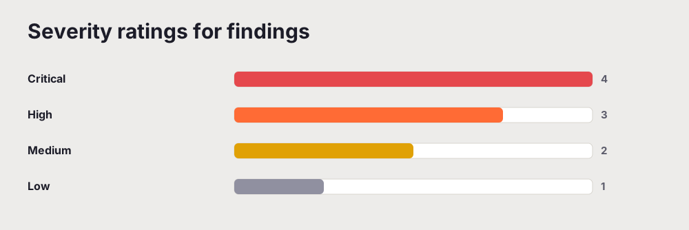
Give each finding a severity. Critical means the user cannot complete their goal. Major means significant friction that causes measurable drop-off. Minor means a suboptimal experience that is unlikely to lose users. Then give each a rough effort estimate: low is under a day, medium is one to five days, high is more than five.
Now plot them on an impact against effort grid. The picture does the prioritising for you.
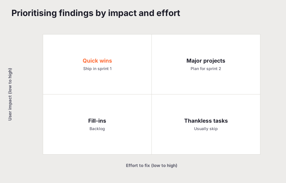
High-impact, low-effort findings are your quick wins. Ship them first. High-impact, high-effort findings are real projects that belong in the next sprint. Low-impact findings are backlog candidates or, honestly, things to drop. Naming severity out loud also settles disagreements: once a team agrees a finding is critical, the argument about whether to fix it is over.
Step 5: Build a sprint roadmap
The most common way a UX audit fails is that it ends as a list of problems that nobody actions. Prevent that by shaping the output as a roadmap, not a findings dump.
Sprint one, this week: quick wins. Fix copy, adjust contrast, simplify a navigation label, remove a form field. Sprint two, this month: structural fixes such as an onboarding redesign or a form split into steps. Sprint three, this quarter: strategic work like reworking the navigation architecture or the conversion funnel. Each item carries its severity and its effort estimate, so anyone can see why it sits where it does. Tools like UXAuditPro generate this roadmap automatically, formatted to drop into Jira or Linear.
Step 6: Present and document your findings
A roadmap only gets funded if the write-up is clear. Structure the report in a few parts so any stakeholder can read it fast. Start with a one-page executive summary: the overall score, the top three issues, and the recommended next steps, because decision-makers often read only this. Follow with the scope and method, the dimension scores, and then the detailed findings, each with a screenshot, the problem, the fix, and the severity. Add a short "what is working well" section so the team knows what not to break, and close with the prioritised roadmap.
Keep the language plain and tie every finding to a user goal rather than a personal preference. That is the difference between a report people act on and one that gets skimmed and filed. If you want a deeper treatment of the write-up itself, see how to write a UX audit report that clients actually read.
Common mistakes that weaken an audit
Even teams that follow the steps tend to trip on the same things.
Scoring the design instead of the experience. It is tempting to grade how the product looks. Looks are one small input. Audit what the product asks the user to do and whether they can do it, not whether the palette is on trend.
Skipping mobile. Desktop is easier to capture, so it gets audited and mobile gets a glance. For most products the majority of traffic is on a phone, and mobile fails in its own ways: tap targets too small, key actions below the fold, forms that trigger the wrong keyboard. Give it a full pass.
Confusing severity with effort. A finding that is quick to fix is not automatically low severity, and a hard fix is not automatically important. Rate impact on the user first, effort second, and keep the two columns separate so a cheap fix to a critical problem does not get buried.
Writing findings you cannot support. If you cannot point to the screen and say why it costs a user something, it is an opinion. Leave it out or gather the evidence. Reports lose their authority the moment a reader spots one finding that is really just taste.
Stopping at the list. The findings are the middle of the work, not the end. Without the scoring and the roadmap, a team gets a document, not a plan, and nothing changes.
How long a UX audit takes, and what it costs
A manual UX audit by an experienced researcher takes two to five days and runs from a few thousand dollars into five figures for a typical SaaS product. An automated audit using AI analysis takes under five minutes and delivers the same structured output, dimension scores, prioritised findings, and a roadmap, at a fraction of the cost.
For most teams the right pattern is both. Use automated audits for the regular rhythm, before releases and each quarter, and commission a manual expert review for major redesigns or before a fundraise. That way you catch regressions cheaply and bring human depth to the decisions that carry the most risk.
Doing it yourself versus automating it
Doing the audit by hand teaches you the heuristics and forces you to look closely, which is genuinely valuable the first few times. It is also slow and hard to keep consistent, which is why most products get audited far less often than they should.
An automated UX audit closes that gap. It runs the same structured evaluation, scores the same dimensions, and produces the same kind of roadmap in minutes, which makes it practical to audit before every release. A website UX audit tool like UXAuditPro runs that pass from a URL and scores all six dimensions. The trade is a little depth on the most nuanced, context-specific calls, which is exactly where a human review still earns its place.
The honest recommendation: run automated audits often, bring in a human at the big moments, and stop shipping changes without checking what they do to the experience. You can run a free UX audit now and use the result as the baseline for everything above.
A lot of the friction you will score here comes down to cognitive load, which is worth understanding before you start.
Related reading: UX Audit Checklist: The 60-Point Framework
Frequently asked questions
What is a UX audit?
A UX audit is a systematic, expert-led evaluation of how well a product lets users achieve their goals. It measures the product against established usability heuristics, accessibility standards, and conversion patterns, then returns a score, prioritised findings, and a plan to fix them. Unlike user testing, it does not require recruiting participants, so it is faster and cheaper to run often.
How do I do a website UX audit?
Scope the key flows (usually the path from landing to signup), capture every screen on desktop and mobile, evaluate each against the ten usability heuristics, score and rank the findings by impact and effort, and turn the result into a sprint roadmap. The same five steps apply whether you do it by hand or with an automated tool.
How long does a UX audit take?
A manual audit by an experienced researcher takes two to five days for a typical SaaS product. An automated audit using a tool like UXAuditPro takes under five minutes and returns the same structured output: dimension scores, prioritised findings, and a roadmap. Many teams use the automated version for regular checks and a manual review for major redesigns.
How can I audit my website UX for free?
You can run the manual method above at no cost beyond your time. For a scored, structured version, UXAuditPro gives you one free audit every month: your score, every dimension score and your most severe finding, in a few minutes and with no card.