
You can have a clean layout, fast pages, and a sensible flow, and still watch people hesitate at the exact moment a sentence lets them down. A button that says "Submit" when it should say "Send invite". An error that reads "Something went wrong" and stops there. A blank screen that explains nothing. Those are UX writing problems, and most teams never audit for them. A UX writing audit is a structured review of every word your product shows a user, judged against one question: does this help them do the thing they came to do?
Words are interface. They are not decoration you add at the end. The label on a button is the promise the product makes about what happens when you press it, and when that promise is vague or wrong, people slow down, second-guess, and sometimes leave. If you have already run a full UX audit across navigation, hierarchy, and conversion, the words are the layer that sits underneath all of it, and they are often the cheapest thing to fix.
This guide is the hands-on method. By the end you will know what to look at, how to judge each string, and how to turn a messy pile of copy into a ranked list of fixes you can ship without a redesign.
Why the words deserve their own audit
Most audits grade layout, flow, and visual design, then treat the copy as a detail. That is backwards for a lot of products. A user reads their way through your interface. They read the button before they click it, the error before they panic, the empty state before they decide whether the product is worth their time. Every one of those is a decision point, and the words are what tip it.
The reason UX writing gets skipped is that it hides in plain sight. A confusing paragraph on a marketing page is obvious. A single weak word on a button is easy to walk past a hundred times without noticing, because you already know what it does. New users do not. They meet each string cold, with none of the context you carry in your head, and that is exactly the reader a UX writing audit is run for.
There is a business case too. Clearer words reduce support tickets, because people stop writing in to ask what a setting does. They reduce drop-off on forms, because a good error tells someone how to fix the problem instead of just announcing it. And they lower the mental effort of using the product, which ties directly into cognitive load: every word a user has to decode is effort spent on the interface instead of on their actual goal.
What counts as UX writing
UX writing, sometimes called microcopy, is the functional text inside the product. It is different from marketing copy, which persuades, and different from documentation, which explains after the fact. UX writing works in the moment, at the point of action. Here is where it lives.
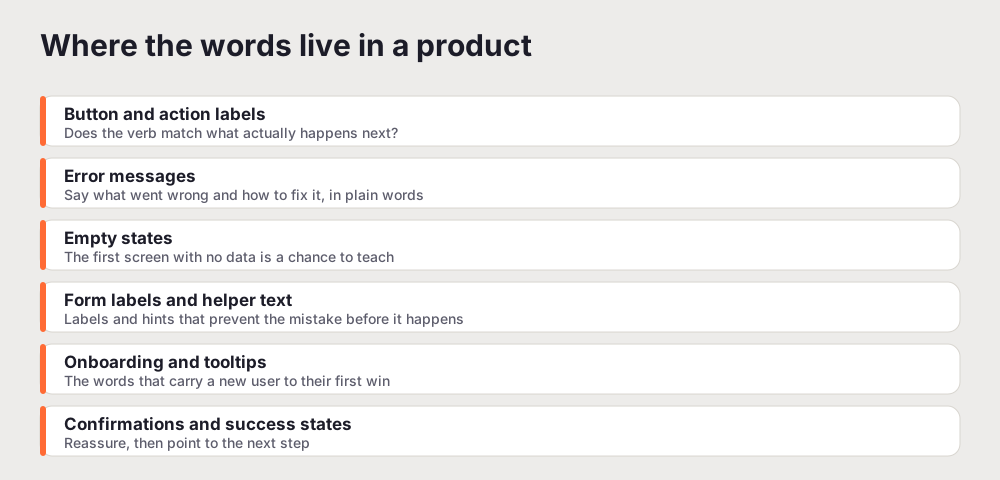
Button and action labels. The single most read words in your product. A label should name the action it triggers. "Save changes" beats "Submit". "Send invite" beats "OK". If a user cannot predict what a button does from its text alone, that is a finding.
Error messages. The highest-stakes copy you own, because the user is already stuck. A good error names what went wrong, explains it in plain terms, and says what to do next. "Something went wrong" fails all three. "That email is already registered. Try logging in instead." passes.
Empty states. The first screen a new user sees often has no data in it yet. Treated as a dead end, it teaches nothing. Treated as an opportunity, it explains what the screen is for and shows the one action that fills it. Empty states are onboarding hiding in plain sight.
Form labels and helper text. Labels, placeholders, and hints decide whether a form is a two-minute task or a source of errors. Helper text that appears before the mistake ("Use 8 or more characters") prevents friction. An error that appears after ("Invalid password") just punishes it.
Onboarding and tooltips. The words that carry a brand-new user from signup to their first real win. This is where you either build trust or lose it, and it is almost always where the SaaS conversion picture is won or lost.
Confirmations and success states. After someone completes an action, a good confirmation reassures them it worked and points to the sensible next step. A missing or vague confirmation leaves people wondering whether they need to do it again.
The rubric: five tests every string should pass
You cannot audit words on instinct alone, because "I like this copy" is not a finding anyone can act on. You need a rubric. Run every string you look at through these five tests, and mark the ones that fail more than one as your priority list.
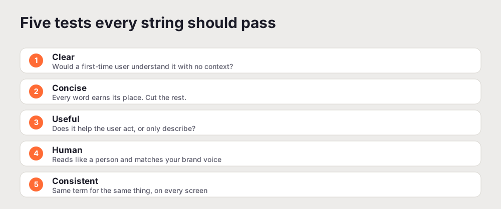
Clear. Would a first-time user understand it with no prior context? Jargon, internal product names, and clever phrasing all fail this test. Clarity beats personality every time the two conflict.
Concise. Every word should earn its place. This does not mean terse. It means no filler. "In order to continue, please click the button below" is six wasted words around one instruction.
Useful. Does the string help the user act, or does it only describe a state? "Loading" describes. "Loading your dashboard, this takes a few seconds" tells the user what to expect and reassures them nothing is broken.
Human. Read it aloud. Does it sound like a person talking, or like a system log? Human does not mean jokey. It means plain, warm, and free of robotic phrasing like "An error has occurred in the operation you requested".
Consistent. The same thing should have the same name everywhere. If you call it a "workspace" on one screen, a "project" on another, and a "board" in the settings, users have to relearn your vocabulary on every page. Consistency is invisible when you get it right and exhausting when you get it wrong.
A string that passes all five is doing its job. A string that fails one might be fine. A string that fails two or more is actively costing you, and that is where the audit should spend its energy.
How to run a UX writing audit, step by step
The rubric tells you how to judge a string. The method below tells you how to work through a whole product without drowning. It mirrors the shape of a broader review, so if you already know how to do a UX audit, this will feel familiar.
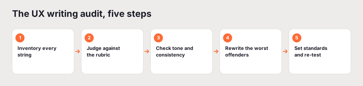
Step 1: Inventory every string
Pick one flow to start, usually the path from signup to first real action, and walk it slowly. Record every piece of visible text you meet: button labels, headings, form labels, helper text, error and empty states, tooltips, confirmations. One row per string, noting the screen and the state it appears in. A spreadsheet is enough. The goal is to make the invisible visible, because you cannot judge words you have stopped seeing.
Do not try to inventory the entire product in one sitting. Scope it to the flows that map to revenue and retention, the same way you would scope any audit. Depth on the flows that matter beats a shallow skim of everything.
Step 2: Judge each string against the rubric
Go down your inventory and score every string on the five tests. Keep it fast and binary at first: pass or fail on each. The strings that fail more than one test rise to the top on their own. This is the moment a vague sense that "the copy feels off" turns into a specific, rankable list of problems.
Step 3: Check tone and consistency
Now read the flagged strings together instead of one at a time. Consistency problems only surface when you compare. You will spot the same action named three ways, a playful line sitting on a screen where someone just lost data, and a voice that swings from stiff to chatty between steps. Note every place the product contradicts itself. These are cheap to fix and they quietly erode trust.
Step 4: Rewrite the worst offenders
Start where the words carry the most weight: error messages, empty states, and the primary button on each conversion step. For each one, rewrite so it names the action, explains the state, and tells the user what to do next, in plain language. Write the strong version next to the weak one so the improvement is obvious to anyone reviewing it. If you want a model for documenting these clearly, the same principles that make a UX audit report readable apply here: show the before, the after, and why it matters.
Step 5: Set standards and re-test
A rewrite that is not written down gets undone the next time someone ships a feature in a hurry. Capture your decisions in a short word list (the canonical name for each object and action) and a few lines on voice. Then re-read the whole flow end to end, as if you were meeting it for the first time, and confirm the words now carry you through without a stumble. That final read is the test that matters.
Microcopy patterns worth fixing first
Some fixes return more than others. If your time is short, start here.
Rewrite every generic error. "Something went wrong" is the most common failure in software copy. Replace it with the specific cause and the recovery step. Even when you genuinely do not know the cause, "We could not save your changes. Check your connection and try again." beats a shrug.
Turn empty states into first steps. Wherever a user lands on a screen with no data, add one line explaining what the screen does and one clear button to fill it. An empty inbox that says "No messages yet. Invite your team to get started." does more work than any tooltip.
Make button labels name the outcome. Audit every primary button and ask what happens when it is pressed. If the label does not say, fix it. This is the single highest-leverage change in most products, because buttons are read constantly and a wrong one causes hesitation at the worst possible moment.
Cut confirmation dread. Destructive actions need words that match the stakes. "This deletes your project and everything in it. This cannot be undone." is honest. "Are you sure?" is not enough information to make the decision.
Tone: consistent beats clever
Teams often reach for personality in their microcopy, and a little warmth genuinely helps. The trap is inconsistency. A joke on an error screen where someone just lost work reads as tone-deaf. A cheerful "Oops!" in front of a serious billing failure undercuts trust. The rule is simple: match the tone to the moment. Be light on success, plain on routine actions, and calm and helpful on errors. Personality is a seasoning, not the meal.
Consistency of voice also means picking a level of formality and holding it. If your product speaks to the user as "you" in a direct, friendly register, do that everywhere. Do not switch to passive, formal system-speak the moment something breaks, which is exactly when a steady human voice matters most.
Where automation helps, and where it does not
An automated UX audit is good at the systematic parts of this work. It can flag vague error text, empty states with no guidance, inconsistent terminology, and content clarity problems across an entire product far faster than a person reading screen by screen. That coverage is useful, especially for catching the same weak pattern repeated in fifty places.
What it is weaker at is nuance: whether a specific phrase lands with your particular audience, whether a joke fits your brand, whether a rewrite sounds like your product or like everyone else's. That judgment still needs a human. The pragmatic pattern is to let a tool surface the systematic issues at scale, then spend your human hours on voice, tone, and the handful of strings that carry the most weight. You can run a free UX audit to get the content-clarity and consistency issues flagged for you, then work the rubric above over the results.
The takeaway is small and worth remembering: the words are interface, and interface can be audited. Treat your copy like any other part of the product, hold it to a rubric, and fix the strings that fail. Users will not send you a thank-you note for clear microcopy. They will just get where they were going, which is the whole point.
Related reading: How to Do a UX Audit: A Complete Step-by-Step Guide
Frequently asked questions
What is a UX writing audit?
A UX writing audit is a systematic review of all the text a product shows a user: button labels, headings, form labels, helper text, error messages, empty states, tooltips, and confirmations. You inventory every string, judge each against a clarity rubric, and rewrite the ones that confuse people or fail to tell them what to do next. It is the words-focused companion to a full UX audit.
What should a UX writing audit check?
Check that each string is clear to a first-time user, concise, useful (it helps the user act rather than only describing), human (it reads like a person and matches your brand voice), and consistent (the same term is used for the same thing everywhere). Pay closest attention to error messages, empty states, and the primary button on each step of a conversion flow, since those carry the most weight.
How is UX writing different from copywriting?
Copywriting persuades: it sells a product on a landing page or in an ad. UX writing guides: it is the functional text inside the product that helps someone complete a task, recover from an error, or understand what a screen is for. A UX writing audit judges words on whether they help the user act, not on whether they sound clever.
How long does a UX writing audit take?
For a focused flow like signup to first action, a manual UX writing audit takes a few hours: an hour or two to inventory the strings, an hour to score them, and the rest to rewrite the priority list. Auditing an entire product is larger, which is why most teams scope it to the flows that map to revenue or retention first, then widen the pass later.
Can you audit microcopy with an automated tool?
Partly. An automated UX audit reliably flags systematic issues like inconsistent terminology, vague error text, empty states with no guidance, and content clarity problems at speed and across a whole product. It is weaker on nuance, brand voice, and whether a specific phrase lands with your audience, which is where a human pass still earns its place.