Most products ship with UX problems the team never noticed. Not because they did not care, but because there was no systematic way to catch them. A checklist fixes that. It replaces "this feels a bit clunky" with a specific, scored list of what is working and what is not.
A checklist is one part of the wider practice. For the full context, see our complete UX audit guide. If you would rather score from a document you can reuse, grab the free UX audit template, and to pick software instead, compare the best UX audit tools.
This is a 60-point checklist across six core dimensions, plus focused checks for mobile, content clarity, and performance. Every item is here on the page. Score each one, total your dimensions, and you will finish with a ranked list of real issues instead of a vague impression.
How to use this checklist
A note on scope before you start: this checklist is deliberately broader than what UXAuditPro scores. The audit reports on six dimensions, Navigation, Visual Hierarchy, Friction Points, Accessibility, Conversion Design, and Mobile UX. The nine sections below add onboarding, content clarity, and performance, because a person working through a checklist by hand can judge things an automated pass should not claim to. Sections here are groupings for scoring by hand, not the product's dimensions.
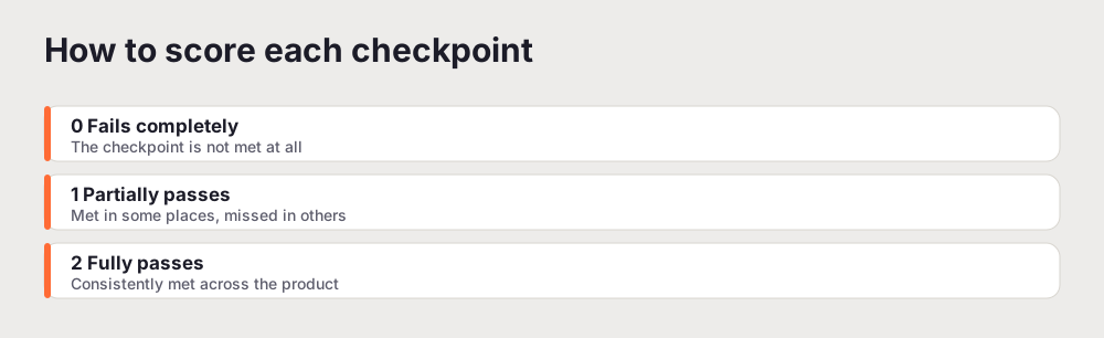
Score each checkpoint on a simple scale: 0 means it fails completely, 1 means it partially passes, 2 means it fully passes. Total each dimension and turn it into a percentage. Any dimension under 60 percent is a priority area that deserves attention before the others.
Do not try to fix things as you go. Score first, across the whole product, then prioritise. Fixing in the order you happen to find issues is how teams spend a sprint on cosmetic problems while a critical one sits untouched.

Section 1: Navigation and information architecture (10 points)
Good navigation is invisible. Bad navigation is the first thing a user notices, and the last thing they forgive. If someone cannot find the main feature or tell where they are, nothing else on this list matters, because they will leave before they reach it.
- Primary navigation is visible and legible on all device sizes
- Active state clearly shows the current location within the product
- No more than two levels of navigation depth for core user flows
- Search is available and returns relevant results for key queries
- Back button and breadcrumbs function correctly throughout
- Navigation labels match the user's mental model, not internal jargon
- Mobile navigation is thumb-friendly and does not obscure content
- Error pages (404) include navigation back to useful content
- External links open in new tabs, internal links stay in-app
- Deep links work correctly and return users to the right context
Section 2: Visual hierarchy and design clarity (10 points)
Your page should guide the eye. Most pages fight it. When everything is emphasised, nothing is.
- Primary CTA is visually dominant on every key screen
- Font sizes create a clear hierarchy from heading to body to caption
- Text contrast meets the WCAG AA standard of 4.5 to 1 for body text
- Whitespace groups related elements and separates unrelated ones
- The most important content is above the fold on a 375px mobile width
- Colour is used consistently and purposefully, not decoratively
- Images and illustrations support the content rather than distract
- Loading states and skeletons keep the layout stable
- No orphaned UI elements, such as buttons without context or unlabelled icons
- Information density is appropriate, with no overwhelming walls of text
Section 3: Onboarding and first-use experience (10 points)
The gap between signup and first value is where most products quietly lose people. Close it.
- New users can complete the core action without contacting support
- Empty states explain what to do next, not just "nothing here yet"
- Progress is shown for multi-step flows, such as step 2 of 4
- Error messages explain what went wrong and how to fix it
- Tooltips or walkthroughs are available for complex features
- Social login is available to reduce signup friction
- Users reach the first real win within the first session
- Onboarding does not require filling in unnecessary profile fields
- A welcome email or in-app prompt guides the next action
- Users can skip optional onboarding steps
Section 4: Friction and form design (10 points)
Every field you ask for is a chance to lose someone. Ask for less, at a better moment.
- Forms request only the minimum information needed at each step
- Field labels stay visible when the field is focused, not just placeholders
- Inline validation fires on blur, not only on submit
- Passwords can be toggled to visible
- Autocomplete is enabled for appropriate fields such as email and address
- Long forms are split into logical multi-step flows
- Success states are clearly communicated after submission
- Loading states prevent duplicate submissions
- Destructive actions such as delete or cancel require confirmation
- Session timeouts warn users before they expire
Section 5: Accessibility (10 points)
Accessibility is not a nice-to-have. It affects real users, and it increasingly affects legal exposure.
- All interactive elements are keyboard accessible
- Focus indicators are visible and not removed in CSS
- Touch targets are at least 44 by 44 pixels on mobile
- Images have descriptive alt text, not a filename or a blank
- Form fields have associated label elements
- Colour is not the only means of conveying information
- Videos have captions and audio has transcripts
- ARIA roles are used correctly where semantic HTML is not enough
- The screen reader announces dynamic content changes
- Zooming the page to 200 percent does not break or clip the layout
Section 6: Conversion design (10 points)
Every friction point on the path to signup costs you customers. Most are invisible until you look. This dimension is where a small change often moves a real number, because you are working on the exact screens where people decide whether to commit.
- CTA copy is specific and outcome-focused, such as "Start free audit" rather than "Submit"
- Social proof is visible near primary CTAs, such as testimonials, logos, or ratings
- Trust signals appear on signup and payment screens, such as security badges or guarantees
- Pricing is clear with no fees revealed only at checkout
- A free trial or freemium offer is communicated prominently
- Urgency and scarcity claims are truthful and specific
- Comparison tables are scannable and highlight the recommended plan
- Checkout reduces fields to the absolute minimum
- Post-signup confirmation sets expectations for the next step
- Upsell and cross-sell placement does not interrupt core flows
Section 7: Mobile UX (6 points)
More than half of most products' traffic is on a phone. Treat mobile as the primary experience, not an afterthought.
- The page loads in under three seconds on a 4G connection
- Body text is readable without pinching to zoom, at least 16 pixels
- Tap targets are large enough and spaced far enough apart to hit accurately
- No unintentional horizontal scrolling appears anywhere
- Primary actions sit within easy reach of one thumb
- Inputs use the right type so the correct mobile keyboard appears
Section 8: Content clarity (5 points)
Clear copy converts better than clever copy, every time. If this dimension scores low, a focused UX writing audit of your buttons, errors, and empty states is usually the fastest way to lift it.
- A non-technical person can understand the homepage in one read
- The value proposition appears in the first sentence of the hero
- Feature names are self-explanatory and do not need a glossary
- The FAQ answers the real objections buyers have, not just password resets
- Pricing is transparent and easy to find
Section 9: Performance (5 points)
Slow products feel broken. Users equate speed with quality, whether that is fair or not, and a slow first load costs you people before they have seen a single thing you built.
- Largest Contentful Paint is under 2.5 seconds
- Cumulative Layout Shift is below 0.1, so elements do not jump while loading
- Images are compressed and served in modern formats such as WebP or AVIF
- Web fonts load without a flash of unstyled text
- Slow or failed network requests are handled gracefully with useful messaging
The three most common ways products fail this checklist
Run this checklist across enough products and the same failures keep surfacing. Knowing them in advance helps you spot yours faster.
The first is the invisible primary action. The signup or purchase button is there, but it competes with a busy hero, sits below the fold on mobile, or uses a label so generic that nobody reads it as the next step. A product can pass almost every other checkpoint and still leak users here, because this is the one action the whole page exists to drive.
The second is onboarding that assumes knowledge the user does not have. The team has seen the product a thousand times, so empty states say "nothing here yet" instead of "create your first project to get started", and the first screen after signup offers ten options instead of one obvious next move. New users do not fail because the product is weak. They fail because nobody showed them the door.
The third is treating accessibility and mobile as separate, later projects. Contrast that fails the standard, tap targets too small to hit, focus states stripped out in CSS, and forms that trigger the wrong keyboard. None of these are hard to fix. They persist because they never get audited, since the person testing is usually on a large desktop screen with a mouse. Test the way your users actually arrive.
How often to run it
A checklist you use once is a wasted afternoon. The value is in repetition. Run the full checklist before any major release, and a lighter pass on the flows you changed before every ship. Set a calendar reminder to run the whole thing once a quarter even when nothing big is shipping, because products drift: a quick fix here, a new field there, and six months later a flow that used to score well has quietly degraded. Catching that drift early is far cheaper than discovering it in a drop in conversion.
What a checklist cannot tell you
A checklist is a strong tool, and it has a real limit worth naming. It measures whether a product follows known good practice. It does not measure whether the product solves the right problem for the right person. You can pass all 60 points and still have a product nobody wants, because the checklist checks the execution, not the idea.
That is why a checklist works best alongside two other things. Analytics tell you where users actually drop off, which helps you weight the checkpoints that sit on real paths. Talking to a few users tells you why, which no checklist can. Use the checklist to find where the experience breaks known rules, use analytics to confirm it costs you something, and use conversations to understand what people were trying to do when it broke. Together they cover far more than any one of them alone.
None of that reduces the checklist's value. It just sets the expectation correctly: this is the fastest way to find the mechanical problems in an experience, and mechanical problems are the majority of what quietly loses users.
Turning the score into action
Once every dimension has a percentage, the audit almost prioritises itself. Rank the dimensions from weakest to strongest. The weakest one or two are where your next sprint goes. Inside each weak dimension, fix the checkpoints that sit on a revenue or activation path first, then the rest.
Resist the urge to chase a perfect score everywhere. A product that is strong on navigation and conversion but failing on accessibility does not need small polish across the board. It needs the accessibility gap closed. The checklist is most useful not as a grade, but as a map of where the effort will pay off.
If working through 60 items by hand sounds like a lot, that is exactly the job an automated audit does well. Run a free UX audit and it scores the same ground against your live product in a few minutes, then hands you the prioritised version of this list.
Two dimensions below deserve their own deeper reads: keyboard accessibility testing and the accessibility audit for SaaS.
Related reading: How to Do a UX Audit
Frequently asked questions
What is a UX audit checklist?
It is a structured list of checkpoints you score a product against, grouped by dimension such as navigation, accessibility, and conversion. It makes a review objective and repeatable: instead of reacting to a general impression, you check each item and score it, so two people auditing the same product reach similar conclusions.
What should I look for in a UX audit?
Work through the areas where drop-off actually starts: whether users can navigate and find the main feature, whether each screen guides the eye, whether onboarding gets people to a first win, whether forms ask only what they need, whether the product is accessible, whether the value and trust signals are clear, and whether it holds up on mobile and on a slow connection.
How do I audit my website UX for free?
Work through this checklist by hand, scoring each item 0, 1, or 2, and total each dimension. That costs nothing but time. For a scored version run against your live product automatically, UXAuditPro covers the same ground in a few minutes, and you get one free audit every month.
How many points is a good UX audit score?
Score each checkpoint 0, 1, or 2 and turn each dimension into a percentage. Anything under 60 percent in a dimension is a priority area. The number matters less than the pattern: a dimension that scores far below the others tells you where to spend your next sprint.