You have a product that is not converting the way it should, and you suspect the experience is the problem. Fair guess. The harder question is which tool to point at it, because the word "audit" covers tools that work in completely different ways. Some watch real users. Some score your product against a rulebook. Some just give you a heatmap and leave the thinking to you.
If you are still deciding whether you need a tool at all, our complete UX audit guide covers the method, and how to do a UX audit shows the manual version these tools automate. If you are weighing a tool against paying for help, we compared an automated UX audit against hiring an agency separately.
This guide covers the main options, what each is actually good at, roughly what it costs, and where each one wins and loses. We are honest about where competitors beat us, because that is the only version of this article worth reading.
What separates a useful tool from a demo
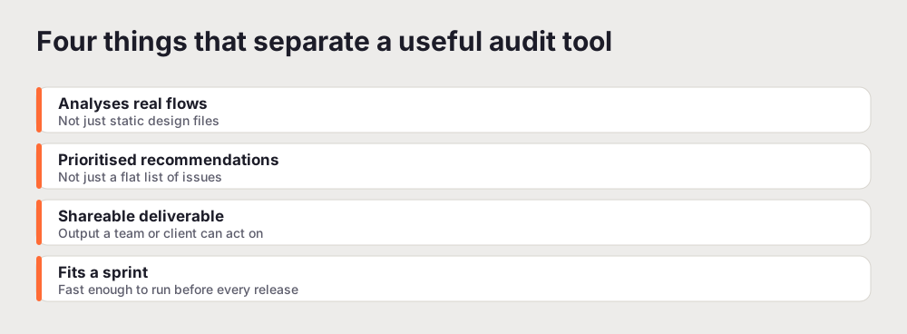
Before the list, here is the bar. A UX audit tool earns its place when it does four things.
It analyses real flows, not static files. A tool that grades a Figma frame tells you about a picture. Figma plugins for UX review are worth running before handoff, but they check the design, not the product. You need to know how the live product behaves when someone tries to sign up on a phone with one bar of signal.
It prioritises. A list of forty issues with no ranking is not an audit, it is homework. The useful output tells you which three things to fix first and why.
It produces something shareable. If you cannot hand the result to an engineer or a client without rewriting it, the tool has done half the job.
It fits inside a sprint. A method that takes a week will get run once. A method that takes minutes gets run before every release, which is where the real value compounds.
Keep those four in mind as you read. They are also a fair way to judge anything not on this list.
How we compared them
We did not score these tools on a spec sheet. We ran the same kind of task through each one, a real audit of a live SaaS product, and judged them on what a working team actually cares about: how long it took to get a usable result, whether the output pointed at specific fixes or just described problems, whether we could hand the result to someone else without rewriting it, and how much the tool cost to run again next month. Where a tool was built for a different job, session replay rather than scoring, for example, we judged it on its own terms rather than marking it down for not being an audit tool. The comparisons below reflect that. A tool can be excellent and still be the wrong choice for your question, and most of the disagreement about "the best UX audit tool" comes from people comparing tools that were never trying to do the same thing.
The tools, compared
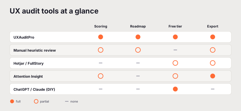
Here is the short version. Details, pricing, and the honest downsides are below.
| Tool | Type | Free tier | Best for |
|---|---|---|---|
| UXAuditPro | AI audit, scored | Yes, one audit a month | A fast scored audit with a roadmap |
| Manual heuristic review | Expert, human | No | High-stakes redesigns |
| Hotjar / FullStory | Behavioural analytics | Yes, limited | Seeing where users actually drop off |
| Attention Insight | AI attention prediction | Trial | Above-the-fold and landing pages |
| Maze / Userlytics | Research platforms | Limited | Structured user testing at scale |
| ChatGPT / Claude | General AI, DIY | Yes | A quick, free gut check |
A note on pricing before we go tool by tool: prices on these products change often, and several are quote-based or usage-based rather than a flat monthly number. Rather than print figures that will be wrong by the time you read this, we describe the shape of each one (free tier, paid, quote-based) and point you to check the current number yourself. The one figure that is stable and worth stating plainly: UXAuditPro gives you one free audit every month, no card.
1. UXAuditPro, best for a fast scored audit
UXAuditPro is built for one job: take a URL and return a structured UX audit. You can try the website UX audit tool on your own page. It runs a dual-AI analysis across six dimensions, Navigation, Visual Hierarchy, Friction Points, Accessibility, Conversion Design, and Mobile UX, and cross-references the two models so the findings are steadier than a single pass. The output is a scored report with a prioritised list of issues and a sprint roadmap you can hand straight to engineering.
Pricing: one free audit every month, no card. Paid usage and a white-label tier sit above that for teams and agencies who run audits regularly.
Where it wins: speed and structure. You get dimension scores, specific findings, and a roadmap in minutes, in a format you can share without editing. For a founder or a product manager who wants a defensible starting point before a redesign, that is hard to beat.
Where it loses: it is focused on UX specifically. It does not replace a full SEO audit or a dedicated performance testing suite, and it does not watch real user sessions. If your question is "what are people actually doing on this page", pair it with a behavioural tool below.
2. Manual heuristic evaluation, best for high-stakes work
The oldest method still holds up. A trained reviewer works your product against a known framework, usually the Nielsen Norman Group's ten usability heuristics, and records each violation with a location, a severity, and a fix. Done by someone experienced, it catches nuanced, context-specific problems that no automated tool will.
Pricing: this is people, not software. A thorough manual audit of a medium-complexity product runs from a few thousand dollars into five figures, and takes days rather than minutes.
Where it wins: depth and judgement. For a major redesign, an enterprise flow, or anything where the cost of being wrong is high, a human expert is worth the money.
Where it loses: speed and repeatability. You will not run this before every release, and quality depends entirely on who you hire. Two reviewers can return different findings on the same product.
3. Hotjar and FullStory, best for seeing real behaviour
Session recordings and heatmaps show you where people actually click, scroll, hesitate, and leave. This is the "what" that a heuristic audit cannot give you, because it is real behaviour rather than expert prediction.
Pricing: both have free or entry tiers, with paid plans that scale by traffic and features.
Where it wins: ground truth. When you already suspect a problem, a handful of session replays will confirm or kill the theory fast. Heatmaps are genuinely persuasive in a stakeholder meeting.
Where it loses: these tools show you the what, not the why or the how to fix it. They surface nothing on their own. You have to know what to look for, watch a lot of sessions, and do the interpretation yourself. They are a microscope, not a diagnosis.
4. Attention Insight, best for above-the-fold decisions
Attention Insight uses AI to predict where users will look on a page before any real traffic arrives, simulating an eye-tracking heatmap from the design alone. For landing pages and hero sections, that is a useful early signal.
Pricing: a limited trial, then paid.
Where it wins: pre-launch visual validation. If you are deciding whether the CTA competes with the hero image, this answers it before you ship.
Where it loses: narrow scope. It tells you where attention goes, not whether the experience is good. It is one input to a UX audit, not the audit.
5. Maze and Userlytics, best for structured research
These are research platforms with AI layered on to speed up synthesis. Maze runs unmoderated tests and prototypes and integrates with Figma. Userlytics runs moderated and unmoderated user testing with AI transcription and insight extraction on top.
Pricing: limited free or trial access, then paid plans that scale with usage and seats.
Where they win: real human signal at scale. When you need to know how actual participants behave on a flow, and you have time to design the study, these are strong.
Where they lose: they need you to run the research first. Neither is an automated audit of an existing product. You bring the questions and the participants; the AI accelerates the write-up.
6. ChatGPT and Claude, best for a free gut check
Paste a screenshot of your product into ChatGPT or Claude, ask a specific question, and you will get feedback that is better than most people expect. For a quick sanity check on a single screen, it is fast and free.
Pricing: free tiers on both.
Where it wins: speed and cost for a narrow question. "What is confusing about this pricing page" gets a useful answer in seconds.
Where it loses: no structure. No consistent scoring, no benchmark, no exportable report, and results drift between runs. It is a second opinion, not a systematic audit.
Common mistakes when choosing a tool
A few patterns cost teams time and money, and they are easy to avoid once you have seen them.
Buying the behavioural tool first. Heatmaps and session recordings are compelling, so they get bought early. The problem is that they show you a thousand things and rank none of them. Without a scored audit to tell you where to look, you can lose a week watching replays and come away with impressions rather than a plan. Get the diagnosis first, then use behaviour to confirm it.
Confusing a performance score with a UX audit. A green Lighthouse score means your code is fast. It says nothing about whether the signup flow makes sense. Teams walk away from a good performance score thinking the experience is handled. It is not the same measurement.
Treating the audit as the deliverable. The audit is the start, not the end. A report that sits in a shared drive changes nothing. The tools that help most are the ones whose output slots straight into a sprint, which is why a prioritised roadmap matters more than a longer list of findings.
Auditing only desktop. More than half of most products' traffic is on a phone. A tool or a reviewer that checks desktop and calls it done has missed the majority of the real experience. Whatever you pick, make sure mobile gets its own pass.
Which one for which job
Strip away the marketing and the choice is simple.
You want a complete, scored audit of an existing site or app, fast. Start with UXAuditPro. It is built for exactly this, there is one free audit every month, and the output is a report you can share the same day.
You are about to invest in a major redesign or a high-risk flow. Commission a manual expert review. The depth is worth the cost when being wrong is expensive.
You already know roughly where the problem is and want proof. Add Hotjar or FullStory and watch real sessions on that flow.
You are validating a landing page before launch. Attention Insight's prediction is a useful pre-flight check alongside a full audit.
You need real user behaviour on a specific flow and have time to run a study. Maze or Userlytics.
You want a free, thirty-second opinion on one screen. Screenshot it into Claude or ChatGPT.
The teams that get the most out of this do not pick one and stop. They run a scored audit for the systematic baseline, then reach for a behavioural or research tool once they know which flow to point it at. AI covers the ground quickly and consistently. Humans bring the judgement. Neither replaces the other, which is the whole point of an honest AI UX audit and what it catches versus misses.
One more practical point. The best tool is the one you will actually use on a schedule. A perfect method that takes a week gets skipped when the release is due, and skipped audits catch nothing. A lighter method you run before every ship date will find far more problems over a quarter than a heavyweight review you run once a year. Pick for the cadence you can sustain, not for the most thorough single pass, and let the depth come from running it often. That is the difference between a tool that decorates a slide deck and one that quietly keeps your UX from sliding backward release after release.
If you want the fast scored baseline to start from, run a free UX audit and use the result to decide where to dig deeper.
A common point of confusion is worth clearing up: read UX audit vs Lighthouse to see why a performance score is not a UX audit.
Related reading: UXAuditPro vs Hotjar vs UserTesting
Frequently asked questions
What is the best UX audit tool?
There is no single best tool, because they do different jobs. For a fast, structured audit of an existing site or app that produces a scored report and a prioritised roadmap, UXAuditPro is the most direct option, with one free audit every month. For watching how real users behave, Hotjar or FullStory are stronger. For deep qualitative research, UserTesting or Maze. Most teams use a scored audit first, then add behavioural tools once they know where to look.
Can I audit my website UX for free?
Yes. UXAuditPro gives you one free audit every month: your score, every dimension score and your most severe finding, with no card. Hotjar and Attention Insight have free tiers. You can also paste screenshots into ChatGPT or Claude for a quick gut check at no cost, though you will not get consistent scoring or an exportable report that way.
What should I look for in a UX audit tool?
Four things: it analyses real user flows rather than static design files, it gives prioritised recommendations rather than a flat list of issues, it produces a deliverable you can share with the team, and it is fast enough to run before a release rather than once a year.
Do AI UX audit tools replace a human UX expert?
No. AI tools are fast and consistent and cover a lot of ground quickly, which makes them a good baseline. A senior UX specialist still adds judgement that automated tools cannot: interviewing users, weighing trade-offs, and designing the fix. The strongest approach uses an AI audit for the systematic pass and a human for interpretation and solution design.