
A user is about to move money out of your app for the first time. They have entered an amount, they can see a button that says confirm, and they pause. Is this the final total or will a fee appear afterwards? Where is this money actually going? What happens if the transfer fails halfway? In most software a moment of hesitation costs you a click. In a financial product it costs you trust, and trust is the entire product. That is what a financial ux audit exists to protect.
Auditing a fintech or money product uses the same method as any other UX review, but the bar is higher and the failure modes are worse. A confusing empty state in a note-taking app is an annoyance. A confusing balance in a banking app makes someone think they have been charged twice. The stakes raise the standard for every screen that touches money, identity, or a number the user is relying on. If you want the general method first, our complete UX audit guide covers scope, scoring, and how to turn findings into a plan. This guide is the fintech-specific layer that sits on top of it.
Below is what to check, grouped the way problems actually cluster in financial products. Work through each area, score what you find, and rank it by how much it erodes trust or risks the user's money.
Trust and security signals
In a financial product, trust is not a nice-to-have that marketing owns. It is a usability property you can audit. A first-time user decides whether to hand over money and identity in the first minute, and they decide it from signals, not from your intentions.
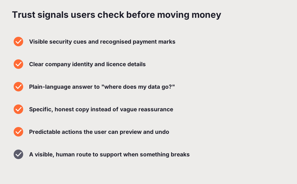
Check that the security cues a user looks for are actually present and genuine: recognised payment marks where relevant, a clear indication that the connection and the account are protected, and no dark patterns that fake urgency around money. Check that the company is identifiable. A money product that hides who runs it, where it is based, and what it is licensed to do reads as risky, even when it is not. Somewhere reachable, a user should be able to answer "who am I trusting?" without leaving the flow.
Watch the copy closely. Vague reassurance ("your money is safe with us") does less than a specific, checkable statement about how funds are held or protected. Overclaiming is worse than saying nothing, because a user who later spots the gap stops believing everything else you say. The honest, specific version wins. This is a place where the words carry as much weight as the design, which is why a UX writing audit of your trust and security copy pays off more here than almost anywhere else.
Finally, check that actions are predictable and, where possible, reversible. A user who can preview exactly what will happen, and undo or cancel before it is final, trusts the product more than one who is asked to commit blind. When something does go wrong, a visible and human route to support is itself a trust signal. A dead end is the opposite.
Clarity of fees, rates, and numbers
The fastest way to lose a money user is a number that surprises them. Fees that appear only after they commit, an exchange rate buried in fine print, a balance that does not obviously reconcile with the last transaction. Every one of these is a finding, and they are among the most common problems in fintech.
Audit every screen where a number decides something. The rule is simple: the user should see the real total, including every fee, before they commit, not after. If a fee is percentage-based or depends on the amount, show it updating live as they type. If an exchange rate applies, show the rate and the resulting amount, not just a promise that it is "competitive". A user doing mental maths to figure out what they will actually pay is a user you are losing.
Check formatting for ambiguity. Currency symbols, decimal places, and thousands separators should be consistent and unmistakable everywhere. A figure like 1,000 versus 1.000 means very different things in different locales, and a money product cannot afford that ambiguity. Dense, number-heavy screens also strain attention, which ties directly into cognitive load: every extra number a user has to hold in their head to understand what they are paying is effort spent decoding your interface instead of trusting it.
One more pattern worth checking: does the product ever show a number without a label or a timeframe? A balance with no "as of" time, a rate with no expiry, an amount with no currency. Unlabeled numbers are a quiet source of support tickets and mistrust.
Error and edge-case handling for money flows
This is the area where a financial ux audit earns its keep. In most products, error handling is a polish task. In a money product, it is core, because the edge cases are exactly the moments where a user can lose funds or lose confidence.
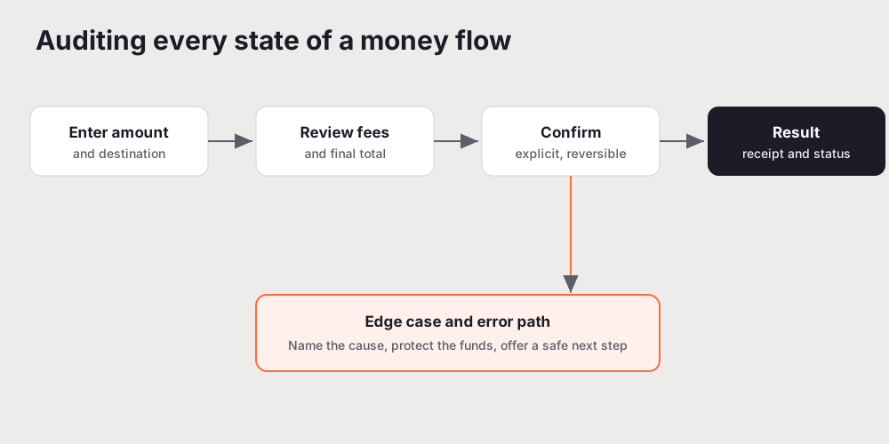
Walk a real money flow end to end: a transfer, a payment, a top-up, a withdrawal. At each state, ask what the user sees and whether it is honest. When a payment is processing, does the product tell them not to retry, so they do not accidentally send twice? When a transfer fails, does the message name the cause and confirm that their money is safe, or does it just say "something went wrong" and leave them wondering whether the funds have vanished? A generic error is bad copy anywhere. On a money screen it is a genuine risk, because a user who cannot tell whether a payment succeeded will either retry and double-pay or abandon a legitimate transaction.
Test the edge cases deliberately. Insufficient funds. A declined card. A network drop mid-transfer. A duplicate submission. A session timeout on a half-finished payment. For each, the product should fail safely: no ambiguous state, no silent loss, no screen that implies success when the money has not moved. The best money flows make the failure state as clear and calm as the success state, because that is when the user is most anxious.
Confirmations matter as much as errors. After money moves, the user needs an unambiguous receipt: what happened, how much, to whom, when, and a reference they can quote to support. A transaction history that is searchable and clear is not a feature you bolt on later. It is part of how a money product earns ongoing trust.
Onboarding and KYC friction
Most fintech products lose more users during onboarding than anywhere else, and a large part of that is the identity verification, or KYC, that regulation requires. You cannot remove KYC. You can absolutely audit how much unnecessary friction sits around it.
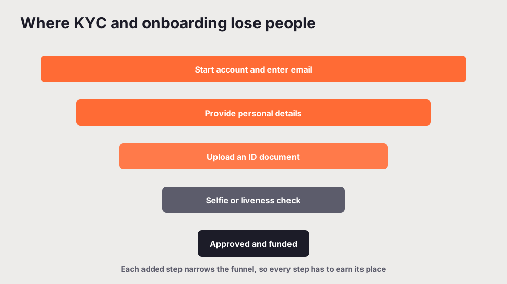
Every step in a verification flow narrows the funnel, so each one has to justify itself. Walk your own onboarding as a brand-new user and count the steps between "I want to sign up" and "I can do the thing I came for". Then ask, for each one, whether it needs to happen now. A common mistake is front-loading every piece of KYC before the user has seen any value. Where the rules allow it, let people explore or set up an account first, and ask for heavier verification at the moment it becomes necessary, such as the first transfer.
Check that the flow explains itself. Users tolerate friction far better when they understand it. Tell them why you need a document, what will happen to it, how long verification usually takes, and what to do while they wait. A silent "upload your ID" with no context reads as intrusive. The same request with a one-line reason reads as responsible.
Then check resilience. A document upload that fails should not wipe the whole form. Progress should save. A rejected photo should say exactly what was wrong ("we could not read the expiry date, try better lighting") instead of a blanket "verification failed". These are the same principles that fix conversion leaks in SaaS onboarding, applied to a flow where the drop-off is even more expensive because acquiring a verified financial user costs more than acquiring an ordinary signup.
Compliance-adjacent UX and disclosures
Financial products carry disclosures, consents, and legal copy that other products do not. This is not the audit deciding what is legally required, which is a job for your compliance and legal teams. It is the audit checking that whatever must be shown is shown in a way a real person can understand and act on.
The tension is real. A disclosure that is buried is a compliance and trust problem. A disclosure so heavy it drowns the action is a usability problem. The audit looks for the honest middle: required information presented in plain language, near the decision it relates to, at a moment the user can actually take it in. A wall of legal text with a pre-ticked box at the bottom satisfies nobody, and increasingly it does not satisfy regulators either.
Check consent patterns specifically. Consents should be explicit, not smuggled into a flow. The user should understand what they are agreeing to, and be able to find it again later. Check that fee schedules, terms, and privacy explanations are reachable without hunting. And check tone: legal copy written for humans, in the product's own voice, is more trustworthy than boilerplate that reads like it was pasted from a template. If you are documenting these findings for stakeholders, the structure in how to write a UX audit report works well here, because compliance-adjacent findings often need the clearest before-and-after framing of anything in the audit.
Mobile UX for money tasks
Most people manage money on a phone now, and money tasks are exactly the ones a small screen punishes hardest. A number entry error is trivial to make with a thumb. A confirmation the user scrolls past is easy to miss. A fee shown below the fold on a narrow screen might as well be hidden.
Audit every money flow on a real mid-range device, not just a desktop browser shrunk down. Check that amount fields use the right input type and keyboard, that totals and fees stay visible near the confirm action rather than scrolling out of view, and that the tap targets on high-stakes buttons are big enough that nobody confirms a transfer by accident. Check that the receipt and status screens are just as clear on mobile as on desktop. Our mobile UX audit guide covers the general method; for a money product, apply it with extra care to any screen where a mis-tap moves funds.
How to run the audit
You do not need a new process for this. You need the standard method with the fintech-specific checks layered on. If you are new to the mechanics, how to do a UX audit walks through scope, heuristic evaluation, and scoring, and the UX audit checklist gives you a scored structure you can extend with the money-specific items above.
In short: scope the flows that touch money and identity first, because that is where the risk and the drop-off concentrate. Walk each one end to end as a first-time user, testing the success path and then the edge cases on purpose. Score every finding, and rank by trust impact rather than by how easy it is to fix, because a small fix on a high-trust screen usually beats a large fix somewhere the user barely notices. Then write it up so the team can act on it this sprint.
If you want a fast first pass, you can run a free scored audit of your live product with UXAuditPro to surface the systematic issues, then spend your human time on the high-stakes money flows and the compliance copy that a tool cannot judge for you.
The takeaway
A financial product is judged on trust before it is judged on features, and trust is built or lost in the details a financial ux audit is designed to catch: honest numbers, safe failures, clear disclosures, and an onboarding path that respects the user's time. Audit the money flows first, weigh every finding by its effect on trust, and fix the small things that make a user hesitate at the moment they are handing you their money. That hesitation is the most expensive thing in your product. It is also the most fixable.
Related reading: How to Write a UX Audit Report That Clients Actually Read
Frequently asked questions
What is a financial UX audit?
A financial UX audit is a structured review of a fintech or money product against usability, accessibility, and conversion standards, with extra weight on the things that only matter when real money and identity are involved: trust and security signals, the clarity of fees and numbers, how the product behaves when a payment fails, compliance-adjacent copy, and the friction of onboarding and KYC. It produces a prioritised list of issues ranked by how much they erode trust or cost the user, not a pile of opinions.
What should a fintech UX audit check first?
Start where the stakes are highest: the money flows themselves. Walk a transfer, a payment, or a top-up end to end and check that the amount and every fee are shown before the user commits, that the confirm step is explicit and reversible where possible, and that a failure names the cause and protects the funds. Then check the trust signals a first-time user reads before they hand over money, and the onboarding and KYC path, since that is where most drop-off starts.
How is auditing a fintech product different from a normal UX audit?
The method is the same, but the cost of getting it wrong is higher and the checks are stricter. In most products a vague error is annoying. In a money product it can make someone think a payment failed when it succeeded, or send funds to the wrong place. Numbers must be exact and unambiguous, security cues must be visible and genuine, and disclosures have to be clear without being so heavy that they bury the action. Trust is the product, so the audit weighs everything by its effect on trust.
Does KYC onboarding have to be high friction?
Some friction is unavoidable because identity verification is a legal requirement, but most fintech onboarding is more painful than it needs to be. You can cut friction without cutting compliance: explain why each piece of information is needed, ask for it at the moment it is relevant rather than all at once, save progress so a failed document upload does not reset the whole flow, and tell the user how long verification will take and what happens next. Friction you cannot remove should at least be honest and predictable.
Can an automated tool audit a financial product?
Partly. An automated UX audit reliably catches systematic issues at speed: accessibility failures, weak visual hierarchy on dense number-heavy screens, inconsistent terminology, vague error copy, and mobile layout problems on money-entry forms. It is weaker on judgement calls that need context, like whether a specific disclosure is legally sufficient or whether a fee is genuinely fair. The strongest approach is an automated pass for coverage and consistency, then a human review of the high-stakes money flows and compliance copy.