
A shopper lands on your product page ready to buy. They have the intent, the card, and the two minutes it should take. Then something slows them down. A price that does not include shipping until the last screen. A form that asks them to create an account before it will take their money. A payment step that looks slightly off on their phone. None of these are dramatic. Each one is just enough friction to make a ready buyer put the phone down, and a buyer who puts the phone down rarely comes back.
That is the whole problem an ecommerce UX audit exists to solve. Not to make the store prettier, but to find every point on the path from product page to confirmation where a person who wanted to buy quietly decided not to. This guide is a checklist you can work through in order, from the product page to what happens after the order lands.
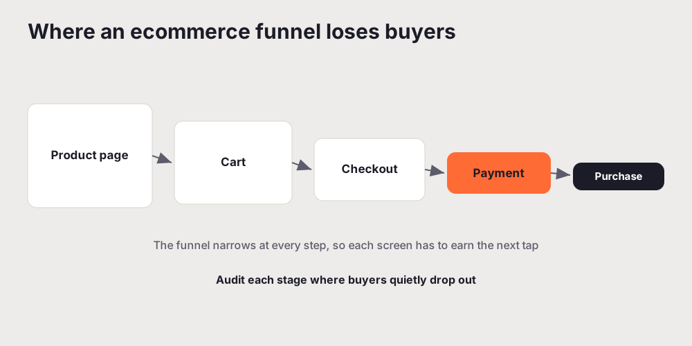
The method is the same one you would use anywhere. If you want the general version first, our complete UX audit guide covers scope, scoring, and how to turn findings into a plan. What follows is the ecommerce-specific layer that sits on top of it: the screens and decisions unique to a store, where the drop-off concentrates, and what to check at each one. Work through each area, score what you find, and rank it by how much it costs you a sale.
Product page: the buying decision surface
The product page is where the buying decision is actually made, and it carries more weight than any other page in the store. A buyer arrives with a question ("is this the right thing for me?") and either gets an answer or leaves. Audit the page against that question, not against how full it looks.
Check that the essentials are visible without scrolling or hunting: what the product is, what it costs, whether it is in stock, and how to add it to the cart. The primary action, usually add to cart, should be the most obvious thing on the screen. If a buyer has to search for the button, or if a sticky promotional bar is competing with it for attention, that is a finding.
Then check the information a buyer needs to feel confident. Clear photographs that show the product from more than one angle. Size, dimensions, or specifications where they matter. Shipping cost and delivery time, ideally before the cart, because an unknown shipping cost is one of the most common reasons a buyer hesitates. Reviews or other social proof, if you have them, placed where a hesitant buyer will actually see them. Every one of these either answers a question or leaves it open, and open questions are where you lose people.
Watch the copy too. Product descriptions that read like a spec sheet dumped from a supplier do not help anyone decide. The words are part of the experience, and a quick UX writing audit of your product pages often surfaces sentences that inform nobody and reassure nobody. If a line of copy does not help the buyer decide, it is taking up space a helpful line could use.
Cart: the honest total before checkout
The cart has one job: show the buyer exactly what they are about to pay for and let them move to checkout without second-guessing it. It is also the last calm moment before the commitment, so it is worth auditing carefully.
The single most important check is the total. The buyer should be able to see the real, final number, including shipping and any fees, at the cart stage, not discover it two screens later. A cost that appears only at the final step is the classic cause of abandonment, because it feels like a small deception even when it is not intended as one. If shipping depends on an address, at least give an estimate or a clear "calculated at checkout" with a way to get the number early.
Check that the cart is easy to edit. A buyer should be able to change a quantity, remove an item, or update an option without the page reloading into confusion or losing their place. Check that the path forward is obvious: one clear button to checkout, not three competing calls to action fighting with a "continue shopping" link that pulls people back out of the funnel.
Cart abandonment is really a conversion problem, and the same discipline that fixes conversion leaks in SaaS onboarding applies here. Find the specific step where people leave, understand why, and remove the reason. The cart is often that step, and the reason is often a number that arrived too late.
Guest checkout and forced account creation
If your store forces a buyer to create an account before they can pay, this is likely the most expensive single line in your audit. Account creation asks for commitment at the exact moment the buyer wants to give you the least of it. They came to buy one thing, and you have asked them to start a relationship first.
Offer guest checkout as the default path. Let the buyer complete the purchase with just the information the order genuinely needs, then invite them to save their details or create an account after the order is placed, when the value of doing so is obvious and the risk to the sale is gone. You lose nothing by waiting, and you remove one of the most reliable reasons people abandon a cart.
While you are here, check how much a returning buyer has to remember. If someone has ordered before, a login should be easy to find and easy to recover, and it should never become a wall that blocks a guest purchase for someone who has simply forgotten they have an account. The account is a convenience you offer, not a toll you charge.
Checkout form friction, field by field
Checkout is the narrowest part of the funnel, so friction here is the most costly friction in the store. Audit the form the way you would audit any high-stakes flow: field by field, asking of each one whether it needs to exist at all.
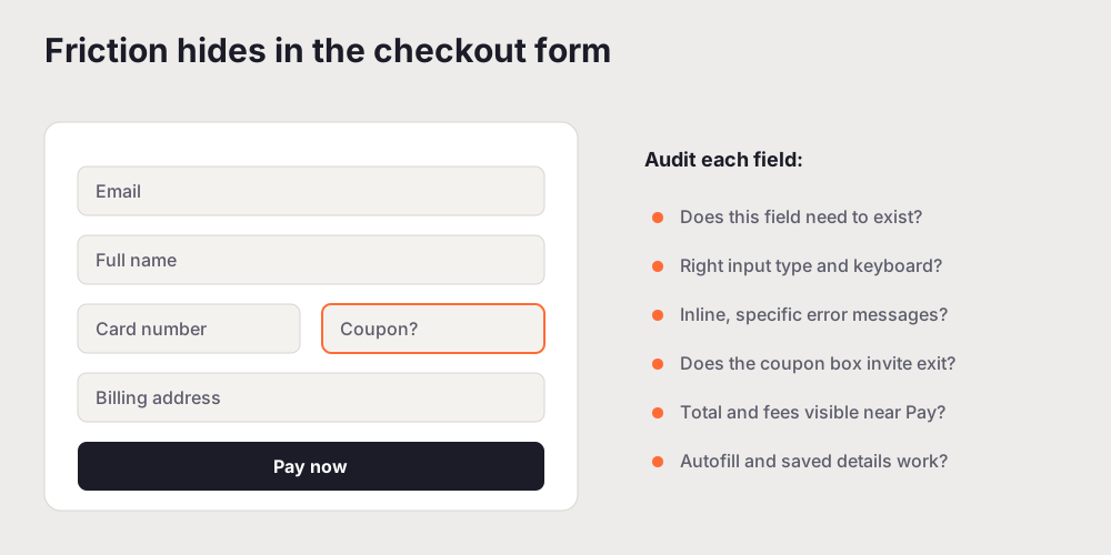
Start by counting the fields and cutting. Every field is a small tax on the buyer, and many checkouts collect information they do not need, or ask for it in a clumsy order. Do you need both a billing and a shipping address by default, or can they be the same until the buyer says otherwise? Do you need a phone number, and if so, do you explain why? A shorter form is not a cosmetic win. It is fewer chances to make a mistake and fewer reasons to give up.
Then check how the remaining fields behave. Each one should use the right input type so mobile keyboards match the task, a numeric keypad for a card number and a card-friendly layout for expiry and security code. Autofill and saved payment details should work, not fight the browser. Labels should stay visible as the buyer types, not vanish into placeholder text they can no longer read.
Error handling is where checkouts quietly fail. When a buyer gets something wrong, the message should say exactly what and how to fix it, next to the field, the moment it matters. "Invalid input" at the top of the page after a failed submit is close to useless. "Your card number is 15 digits, cards are 16" tells them what to do. The number of fields and the clarity of errors both feed straight into cognitive load: every extra decision or unexplained rejection is effort the buyer is spending on your form instead of on deciding to buy.
One more thing to watch: the coupon field. An empty "promo code" box at checkout sends some buyers straight out of the flow to hunt for a code they do not have, and they may not come back. If you offer codes, consider how and where you surface the field so it helps the buyers who have one without unsettling the ones who do not.
Payment trust and security signals
At the payment step, the buyer is about to hand over card details, and trust is either present or it is not. This is not something marketing owns. It is a usability property you can audit directly.
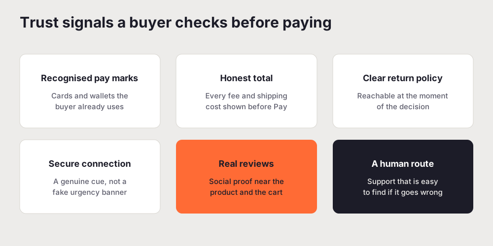
Check that the payment step looks and feels like part of the same store, not a jarring handoff to something the buyer does not recognise. Offer the payment methods your buyers actually use, including the wallets that let them skip typing a card entirely, since a one-tap payment removes a whole screen of friction. Check that recognised payment marks and a genuine secure-connection cue are present, and that you are not faking urgency or scarcity around money, which reads as manipulation and erodes the trust you are trying to build.
The total has to stay honest right to the end. The number at the payment step must match what the cart promised, with no new line item appearing at the last second. A clear, reachable return or refund policy at the point of decision does more for conversion than most banners, because it lowers the perceived risk of buying. And a visible route to a human if something goes wrong is itself a trust signal. A checkout that offers no way to get help when a payment fails feels like a dead end, and buyers do not commit money to dead ends.
Mobile checkout on a real device
Most shopping now starts on a phone, and mobile is where checkout friction bites hardest. A mis-tap is easy, a hidden total is common, and a form built for a mouse becomes a chore under a thumb. Audit the whole purchase on a real mid-range device, not a desktop browser squeezed narrow, because the two behave differently in exactly the places that matter.
Check that the add-to-cart and pay buttons are large enough and far enough from other controls that nobody buys or abandons by accident. Check that the running total and any fees stay visible near the pay button rather than scrolling out of sight. Check that form fields bring up the right keyboard and that autofill works, because typing a full address and card number on a phone is precisely the moment a tired buyer gives up. Our mobile UX audit guide covers the general method; apply it here with extra attention to any screen between the cart and the confirmation.
Post-purchase: confirmation, receipts, and returns
The experience does not end when the payment clears. What happens next decides whether the buyer trusts you enough to come back, and it is the part audits most often skip.
Check the confirmation. After paying, the buyer should get an immediate, unambiguous confirmation on screen: what they bought, how much they paid, and what happens now. A confirmation that is vague about whether the order actually went through sends anxious buyers to your support inbox, or worse, to buy again. The receipt or confirmation email should carry the same clarity, with an order reference they can quote and a realistic sense of when the thing will arrive.
Then check the parts of the experience that only some buyers see but all buyers worry about: order tracking, changing or cancelling an order, and returns. A return policy that is easy to find and easy to act on is not an admission of failure. It is one of the strongest trust signals a store has, because it tells a first-time buyer that the risk of a wrong choice is low. Audit the returns flow the way you audit the checkout, because a painful return is a buyer you never see again.
How to run the ecommerce UX audit
You do not need a special process for this. You need the standard method with the ecommerce checks layered on. If the mechanics are new to you, how to do a UX audit walks through scope, heuristic evaluation, and scoring, and the UX audit checklist gives you a scored structure you can extend with the store-specific items above.
In practice: scope the buying path first, from the product page to the confirmation, because that is where revenue is won or lost. Walk it end to end as a first-time buyer on both desktop and a real phone, doing the whole thing including a return, not just the happy path. Score every finding, and rank by how close it sits to the money, since a fix at checkout usually beats a fix three steps earlier. Then write it up so the team can act on it this sprint.
If you want a fast first pass, you can run a free scored audit of your live store with UXAuditPro to surface the systematic issues, then spend your own time walking the real purchase flow and judging the trust signals a tool cannot weigh for you.
The takeaway
Every abandoned cart is a person who wanted to buy and met one obstacle too many. An ecommerce UX audit is how you find those obstacles before they cost you another sale: the late shipping cost, the forced account, the overlong form, the payment step that felt unsafe, the confirmation that left a buyer unsure. Walk the buying path yourself, weigh each finding by how close it sits to the money, and fix the small frictions that make a ready buyer hesitate. The hesitation right before payment is the most expensive moment in your store. It is also one of the most fixable.
Related reading: Mobile UX Audit: A Step-by-Step Guide for Product Teams
Frequently asked questions
What is an ecommerce UX audit?
An ecommerce UX audit is a structured review of the shopping and checkout experience against usability, accessibility, and conversion standards, focused on the path from a product page through the cart to a completed order. It walks each step as a real buyer would, scores what it finds, and ranks the issues by how much they cost you sales. The output is a prioritised fix list, not a list of opinions, so a team can act on it in the next sprint.
What should a checkout UX audit check first?
Start where the money is closest to changing hands: the checkout itself. Walk a real purchase end to end and check whether the full total, including shipping and any fees, is visible before the buyer commits, whether guest checkout is available, whether the form asks only for what it needs, and whether errors are specific and easy to fix. Checkout is the narrowest part of the funnel, so a small fix there usually returns more than a large fix earlier on.
Why do so many shoppers abandon their carts?
Most abandonment is not indecision. It is friction the buyer meets after they have already decided to buy: an unexpected shipping cost or fee at the last step, a forced account signup, a long or confusing form, a checkout that does not work well on a phone, or a payment step that does not feel safe. An audit exists to find those specific moments and remove them, because a buyer who reached the cart is the most valuable person to keep.
Should ecommerce checkout allow guest purchases?
In almost every case, yes. Forcing account creation before a first purchase is one of the most reliable ways to lose a ready buyer, because it asks for commitment before they have any reason to give it. Offer guest checkout as the default, then invite the buyer to save their details after the order is placed, when the value is obvious. You lose nothing and remove a common reason people leave.
Can an automated tool audit an ecommerce checkout?
Partly, and it is a good first pass. An automated UX audit reliably catches systematic issues at speed: accessibility failures on forms, weak visual hierarchy, missing input types on mobile, vague error copy, and hidden or late-appearing costs. It is weaker on judgement calls, like whether your specific trust signals actually reassure your specific buyers. The strongest approach is an automated pass for coverage, then a human walkthrough of the real purchase flow.